


Baremetrics Dashboard
Track & share your Baremetrics KPIs in real-time with the Numerics dashboard app for your iPhone, iPad, Mac, Apple TV and Apple Watch.

Numerics integrates with Baremetrics enabling you to visualize your subscription analytics and helping you achieve faster recurring revenue growth.
With Numerics, track active subscriptions, MRR metrics, churn metrics and uncover actionable insights across your data. Now focus on the KPIs that matter most and make data-driven decisions anywhere, every time!

Baremetrics provides real-time subscription metrics for teams as well as tools that help them reduce churn and grow the business faster.
KPIs & Key Metrics for Baremetrics Dashboards
Build live Subscription Analytics dashboards using the pre-designed ActiveCampaign dashboard widgets or KPI templates listed below.
Basic


Advanced
A Native Baremetrics Dashboard App for all your Apple devices


Baremetrics Metrics Everywhere!
Have your KPIs & metrics break out of your Subscription Analytics dashboard app into other parts of your devices.
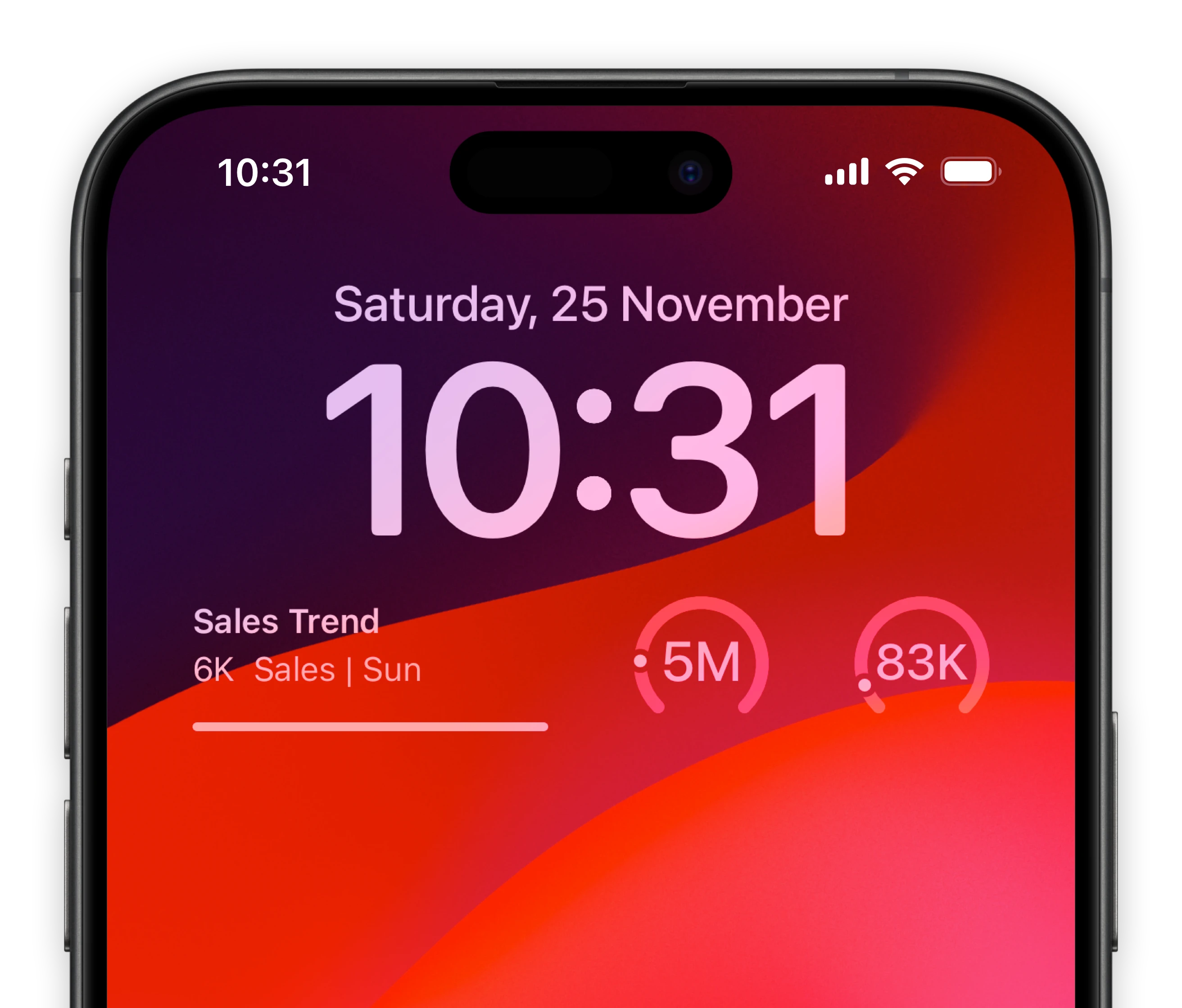
Lock-screen widgets on your iPhone.
Keep track of your most important subscription analytics metrics of Baremetrics right from your iPhone lock screen.

Notification center widgets for your Mac.
Connect your Baremetrics metrics to your MacOS sidebar.
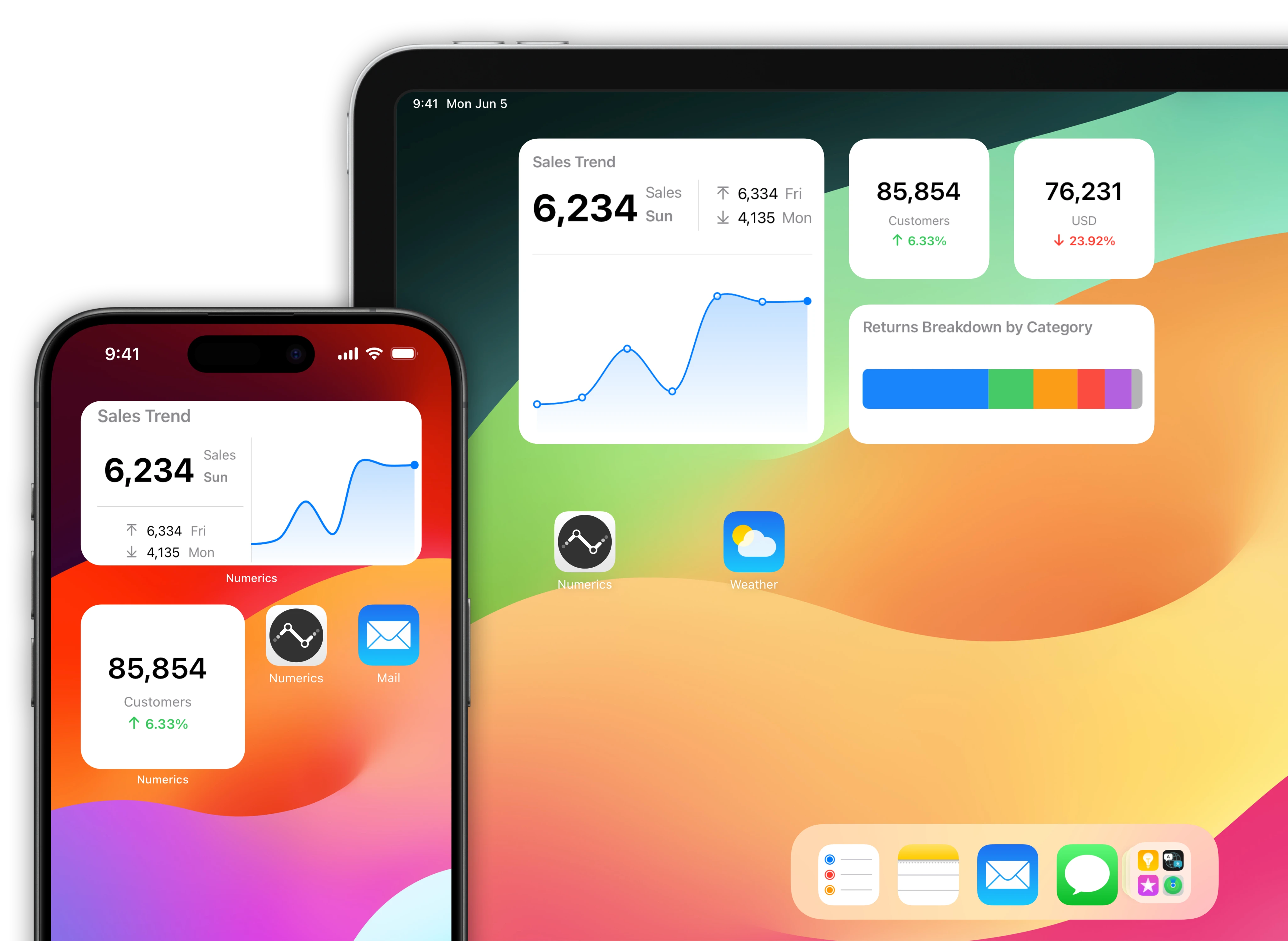
Baremetrics data driven home screens for your iOS Devices.
Native home screen widgets for your iPad & iPhone powered by data from your Baremetrics account.
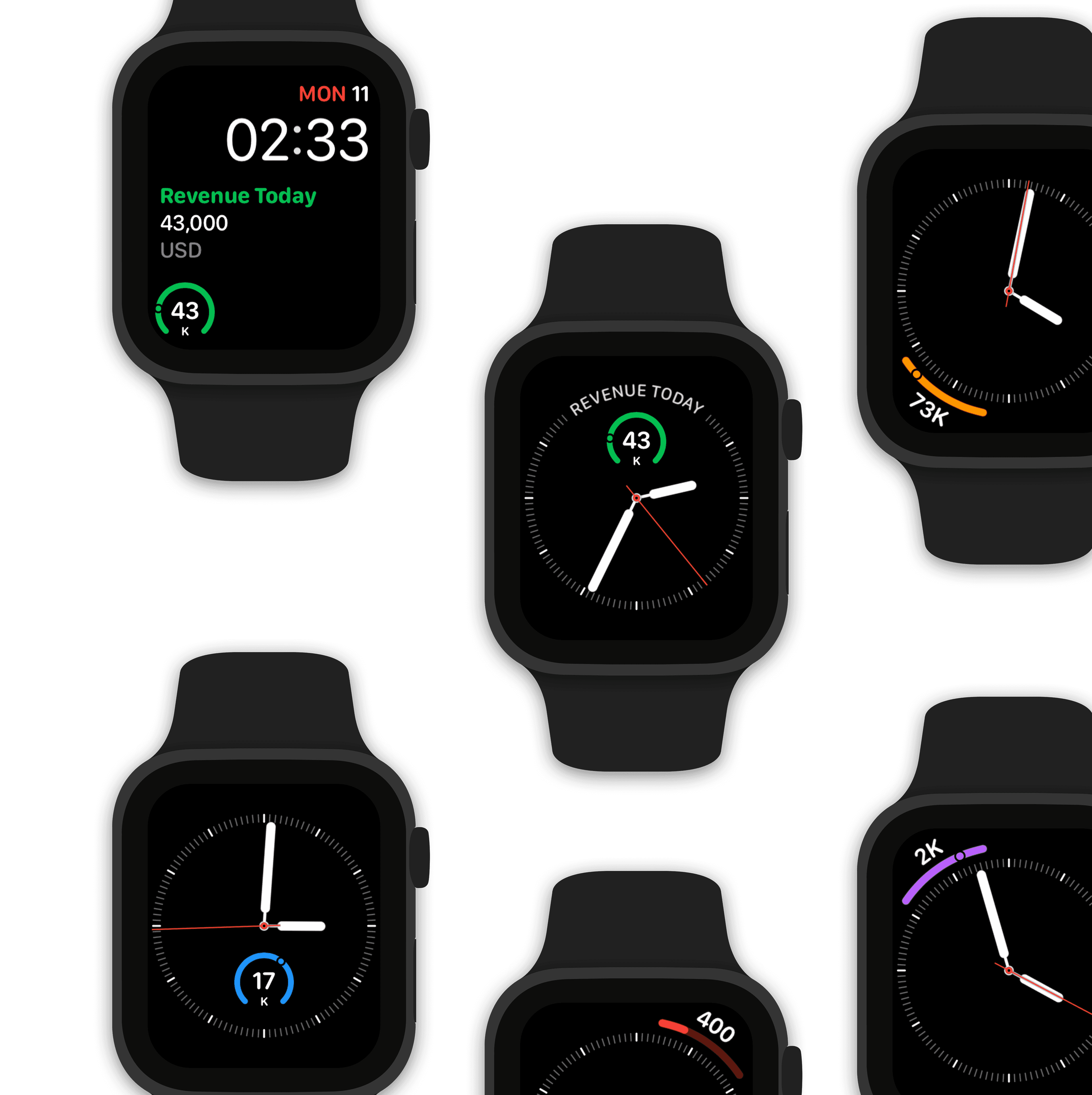
Watch complications for your Apple Watch faces.
Design a custom Subscription Analytics watch face using Baremetrics data.
Make Siri Baremetrics data aware!
"Hey Siri, what is the number of active subscribers?"
The value of number of active subscribers is 12,783 subscribers
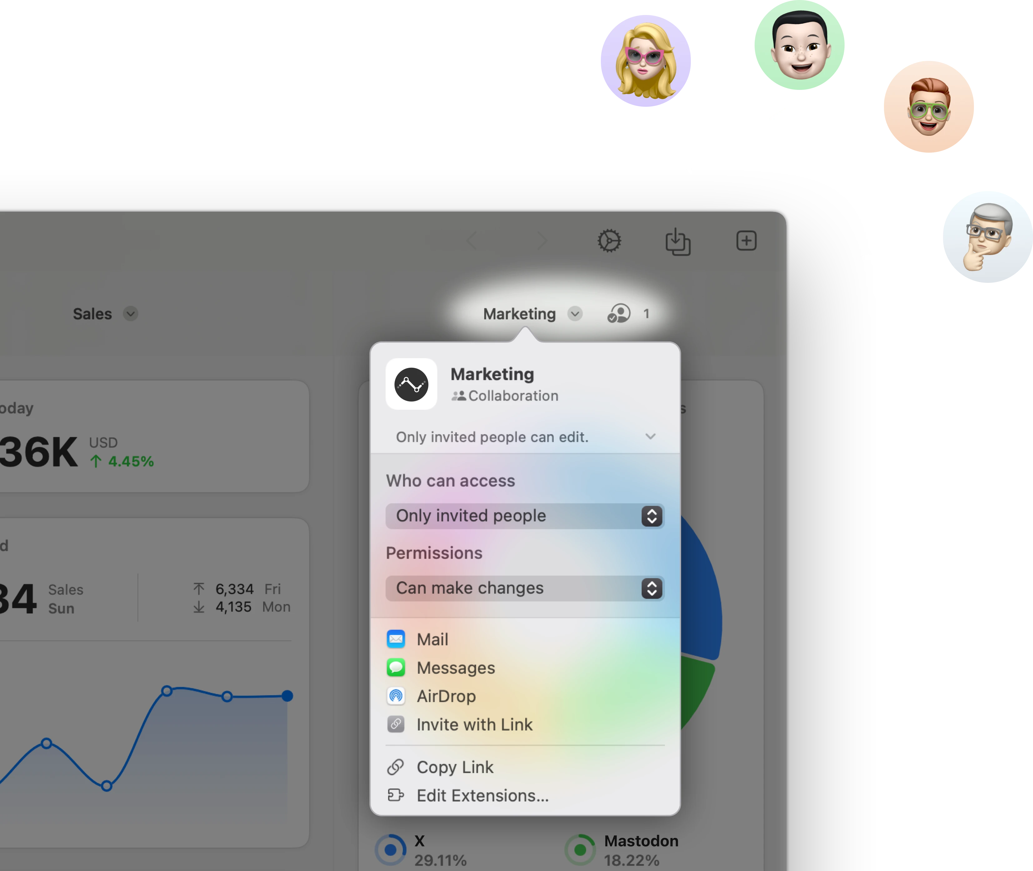
Stream & share Baremetrics KPIs with other users.
Stream a Subscription Analytics dashboard to other Numerics users & co-create dashboards with your team in real-time via secure iCloud sharing & collaboration with Messages.
Related Documents:

Related Blog Posts:

Baremetrics Integration Specifications:
Authentication Type:
Token based auth
Supported plans:
All


Customer Spotlight
Phil Steadman, VP of Operations - Ajax Mazda explains how they use Numerics across their 5 dealerships in Ontario, Canada.


