


Flurry Dashboard
Track & share your Flurry KPIs in real-time with the Numerics dashboard app for your iPhone, iPad, Mac, Apple TV and Apple Watch.

Numerics integrates with Flurry to let you create dashboards to visualize your iOS and Android app analytics.
With Numerics, you never lose sight of your in-app purchases and the rank of your app. Now focus on the KPIs that matter most and make data-driven decisions anywhere, every time!

Flurry is a mobile app analytics platform that provides app usage statistics. With Flurry app developers and publishers can measure user acquisition and retention, track events for in-app actions users take and more.
KPIs & Key Metrics for Flurry Dashboards
Build live mobile Analytics dashboards using the pre-designed ActiveCampaign dashboard widgets or KPI templates listed below.
Hourly App Data
Visualize device and app version related KPIs tracked in Flurry.


App Usage
Identify trends and track KPIs relating to user behavior within your mobile app.

Events
Visualize and track your custom event metrics KPIs.


A Native Flurry Dashboard App for all your Apple devices


Flurry Metrics Everywhere!
Have your KPIs & metrics break out of your mobile Analytics dashboard app into other parts of your devices.
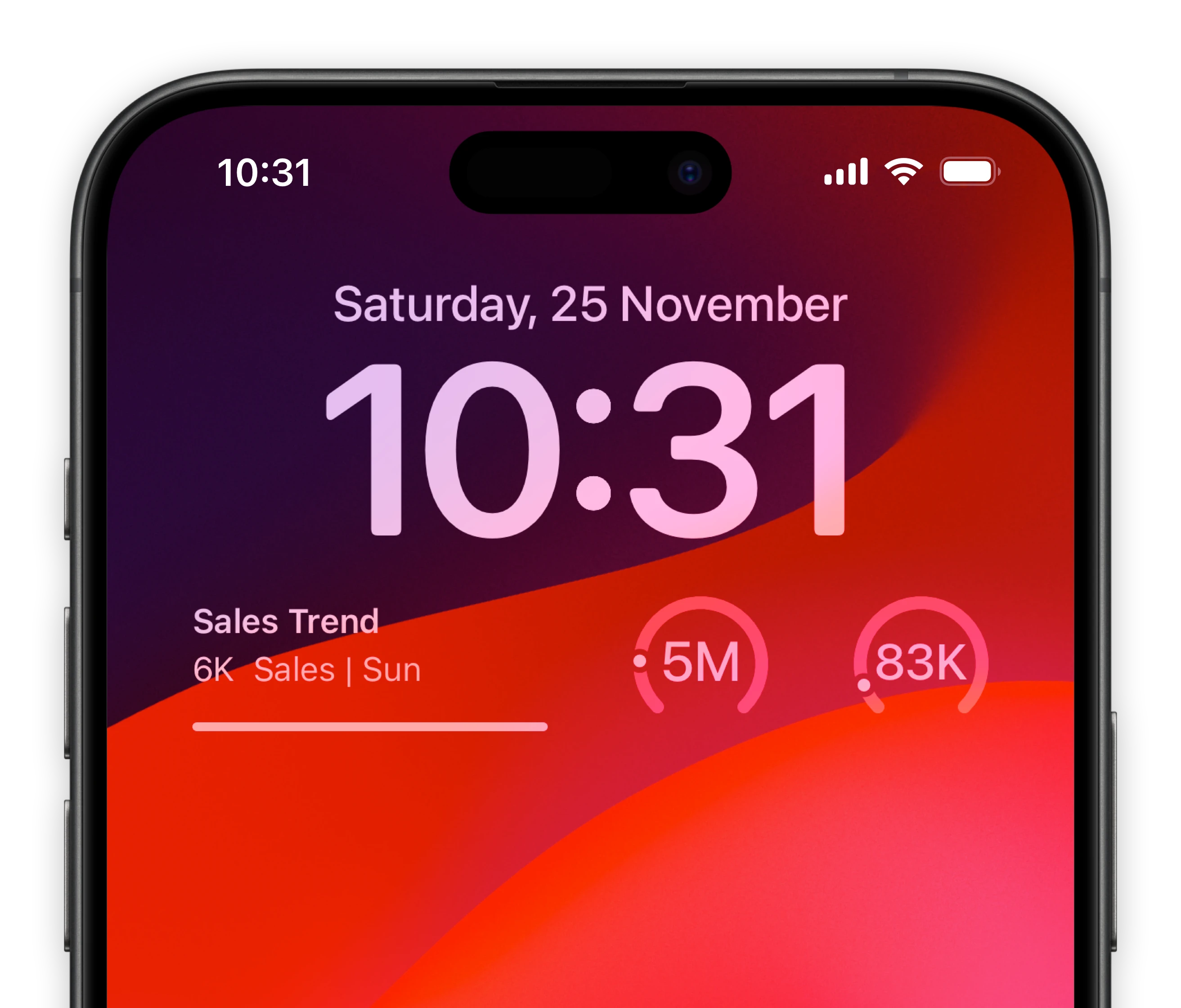
Lock-screen widgets on your iPhone.
Keep track of your most important mobile analytics metrics of Flurry right from your iPhone lock screen.

Notification center widgets for your Mac.
Connect your Flurry metrics to your MacOS sidebar.
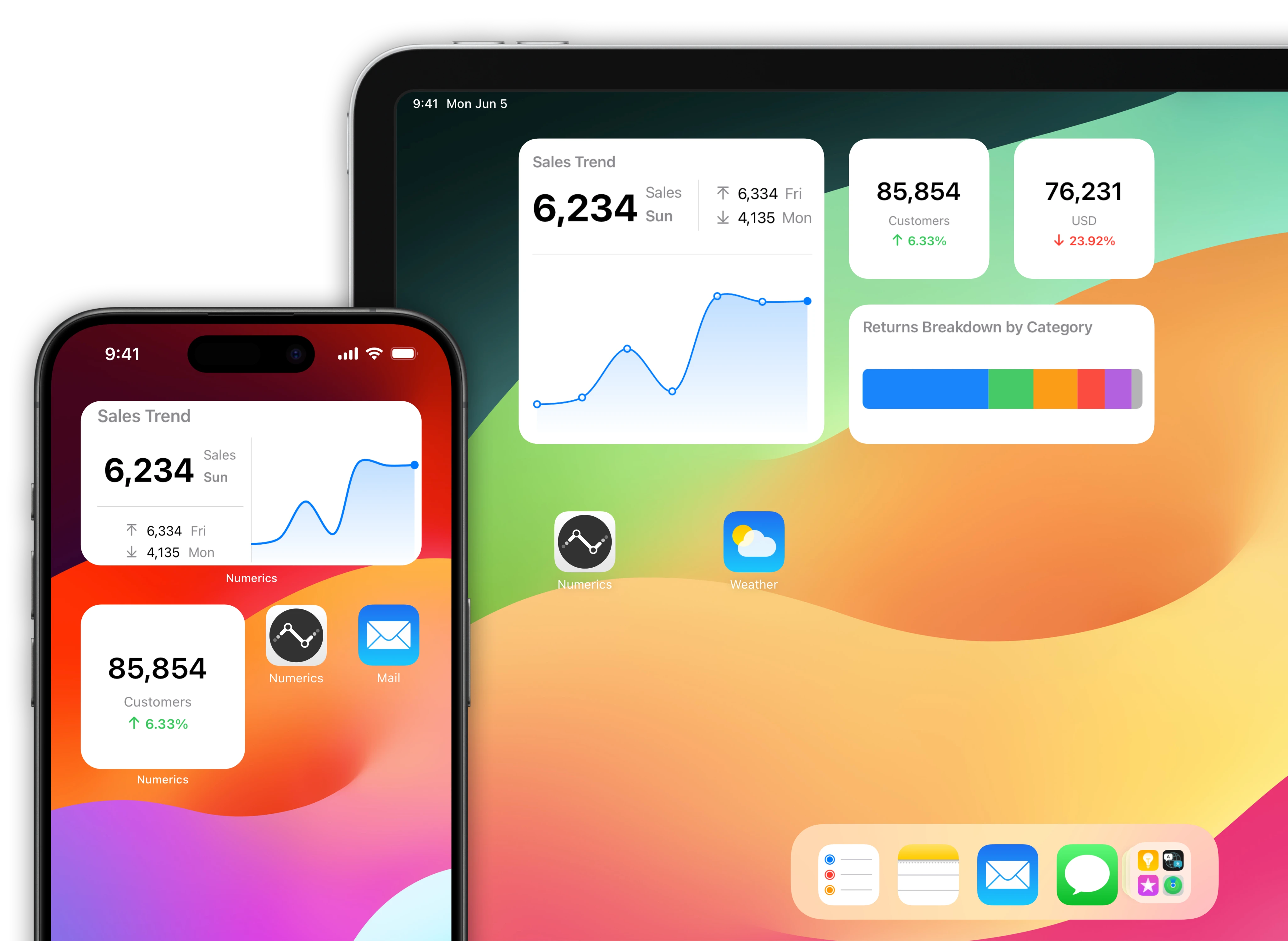
Flurry data driven home screens for your iOS Devices.
Native home screen widgets for your iPad & iPhone powered by data from your Flurry account.
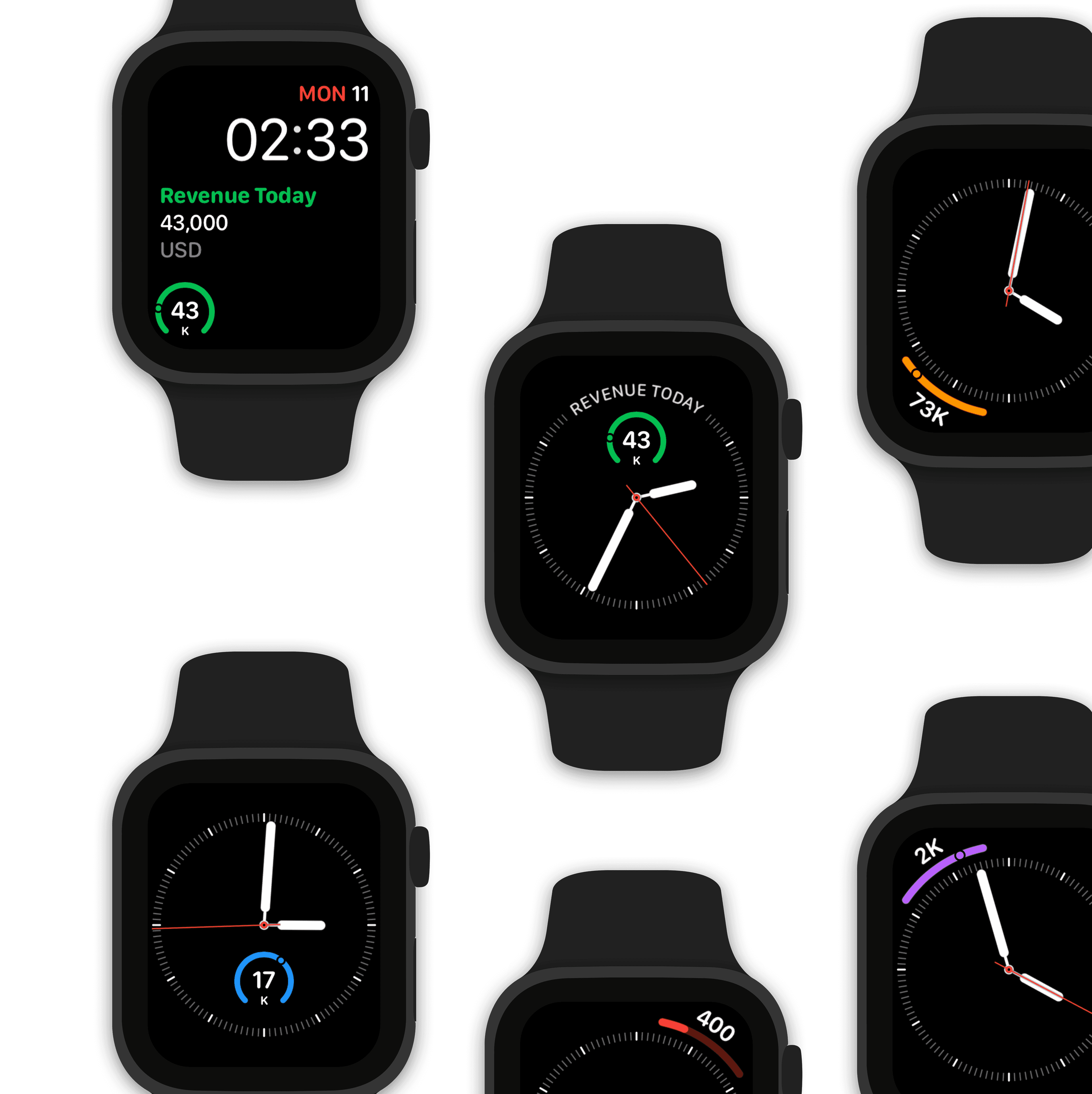
Watch complications for your Apple Watch faces.
Design a custom mobile Analytics watch face using Flurry data.
Make Siri Flurry data aware!
"Hey Siri, what is the event frequency by country?"
The value of event frequency by country is 94,242 that's a 24% increase from previous week.

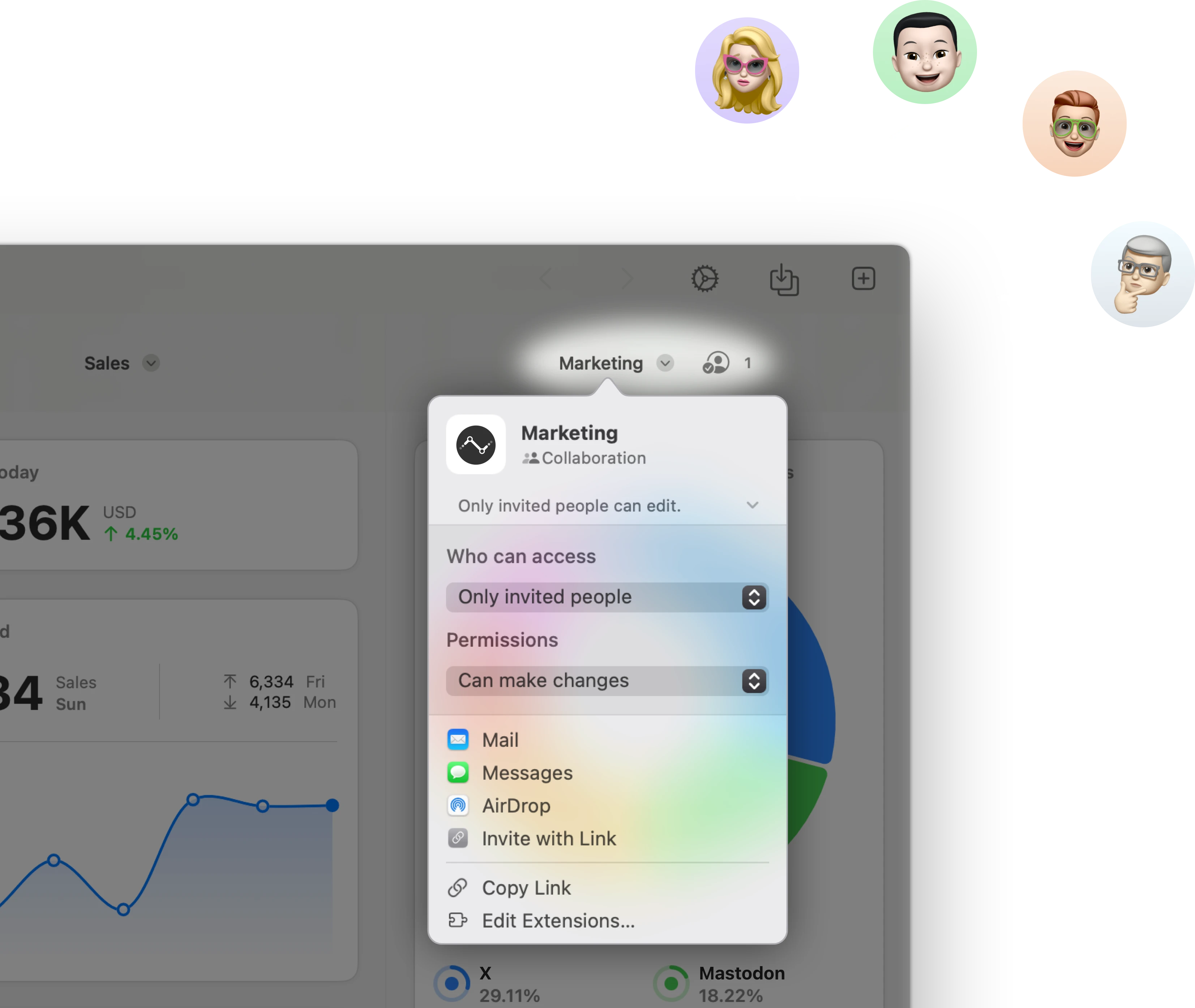
Stream & share Flurry KPIs with other users.
Stream a mobile Analytics dashboard to other Numerics users & co-create dashboards with your team in real-time via secure iCloud sharing & collaboration with Messages.
Related Documents:

Related Blog Posts:

Flurry Integration Specifications:
Authentication Type:
Token based auth
Supported plans:
All


Customer Spotlight
Phil Steadman, VP of Operations - Ajax Mazda explains how they use Numerics across their 5 dealerships in Ontario, Canada.


