


Gmail Dashboard
Track & share your Gmail KPIs in real-time with the Numerics dashboard app for your iPhone, iPad, Mac, Apple TV and Apple Watch.
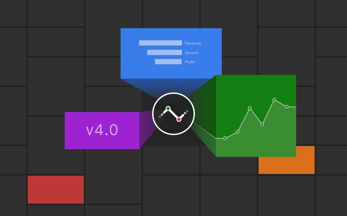
Numerics integrates with Gmail to to help you create producitivity dashboards to monitor KPIs including total number of emails sent or received, by a label or category, distribution of mails by read vs unread and more.
With Numerics, you never lose sight of your email statistics. Now focus on the KPIs that matter most and make data-driven decisions anywhere, every time!

Gmail is Google's popular email service that lets users access email on the web or use third-party programs to synchronize email content through POP or IMAP protocols.
74
Pre-built Gmail KPI Templates.
Easy-to-use widget templates that serve as the building blocks to customizing your Gmail dashboard.
74
Pre-built Gmail KPI Templates.
Easy-to-use widget templates that serve as the building blocks to customizing your Gmail dashboard.
Easy custom team performance dashboard design.
Connect with your Gmail account and create your own dashboards in minutes. No coding or training is required.
Easy custom team performance dashboard design.
Connect with your Gmail account and create your own dashboards in minutes. No coding or training is required.
Easy custom team performance dashboard design.
Connect with your Gmail account and create your own dashboards in minutes. No coding or training is required.
Secure, direct device-to-Gmail connections.
The only Gmail Dashboard tool on the planet that does not replicate your data and connects to the Gmail servers directly from your devices. No intermediary cloud servers, secure by design.
Secure, direct device-to-Gmail connections.
The only Gmail Dashboard tool on the planet that does not replicate your data and connects to the Gmail servers directly from your devices. No intermediary cloud servers, secure by design.
Secure, direct device-to-Gmail connections.
The only Gmail Dashboard tool on the planet that does not replicate your data and connects to the Gmail servers directly from your devices. No intermediary cloud servers, secure by design.
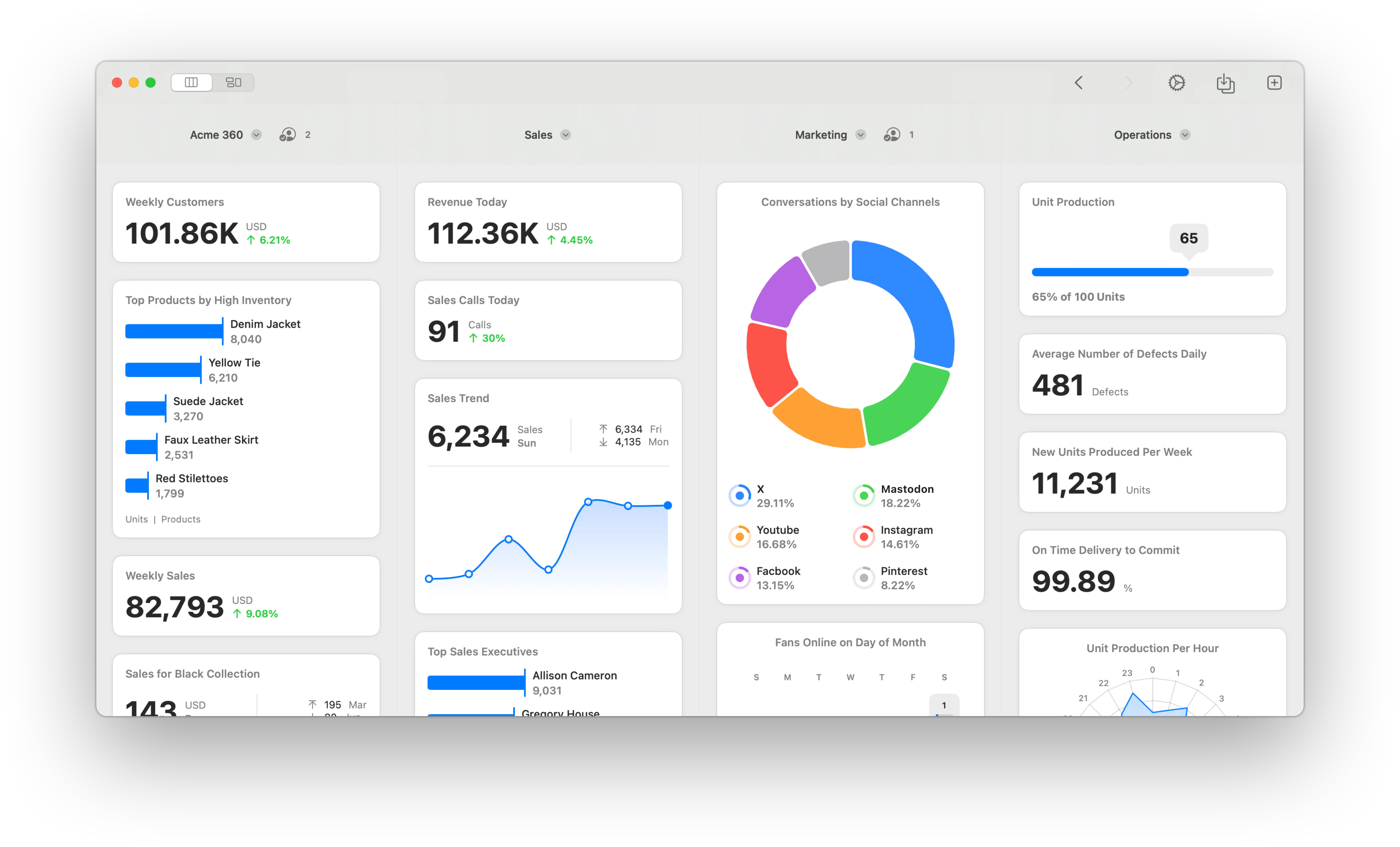
KPIs & Key Metrics for Gmail Dashboards
Build live team performance dashboards using the pre-designed Gmail dashboard widgets or KPI templates listed below.
Priority Mailbox


Mailbox
Labels
Categories
A Native Gmail Dashboard App for all your Apple devices
Gmail Metrics Everywhere!
Have your KPIs & metrics break out of your team performance dashboard app into other parts of your devices.
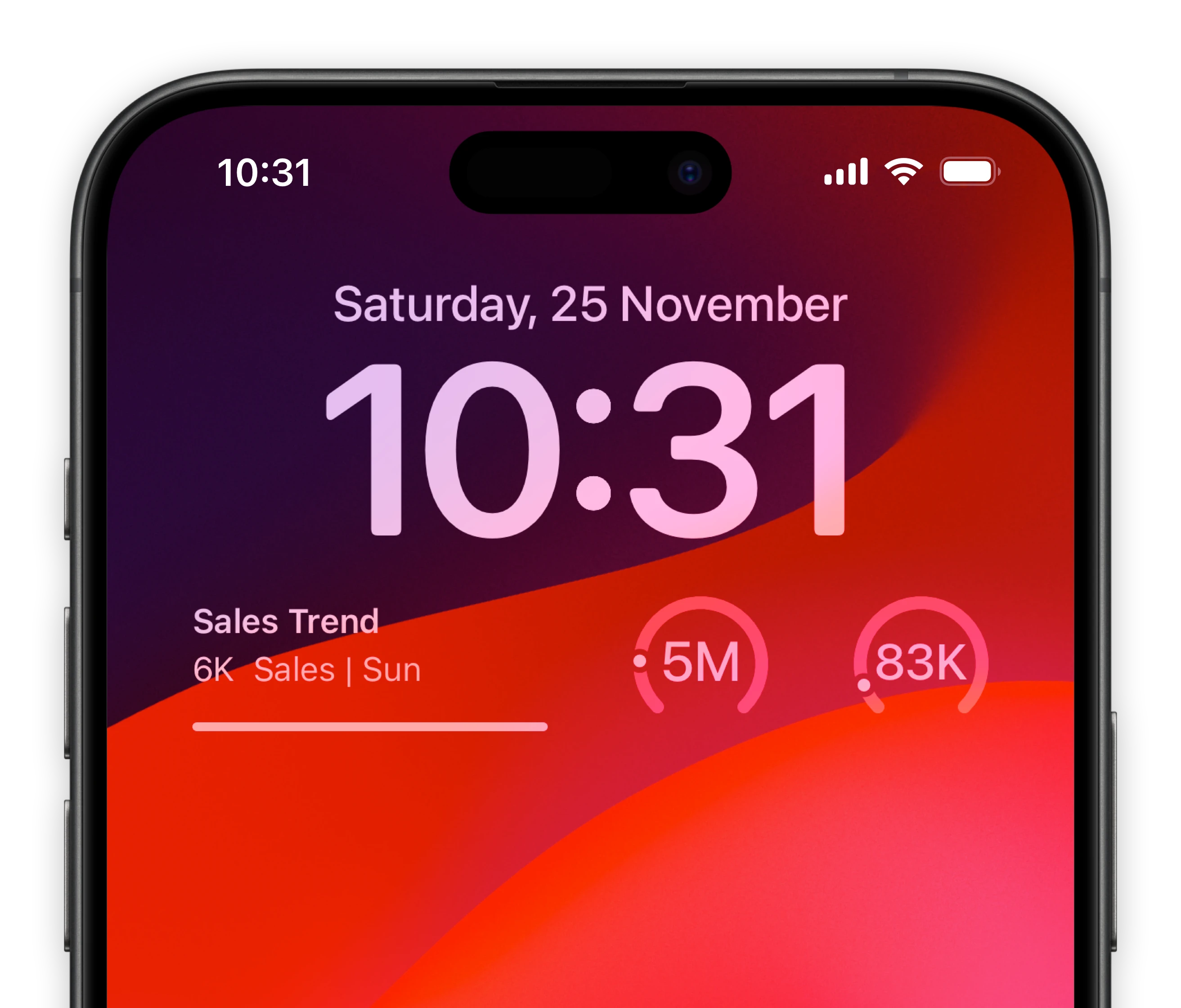
Lock-screen widgets on your iPhone.
Keep track of your most important task management metrics of Gmail right from your iPhone lock screen.
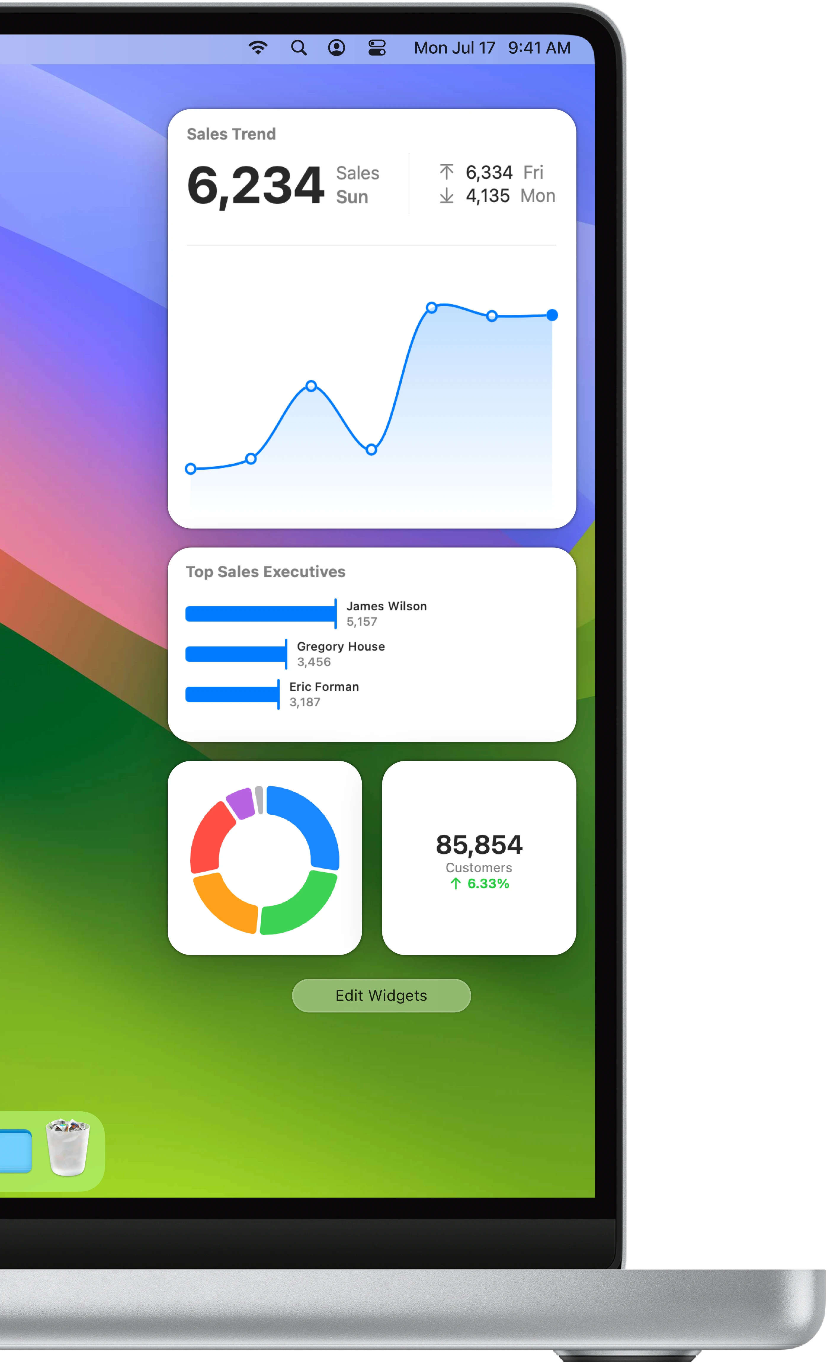
Notification center widgets for your Mac.
Connect your Gmail metrics to your MacOS sidebar.
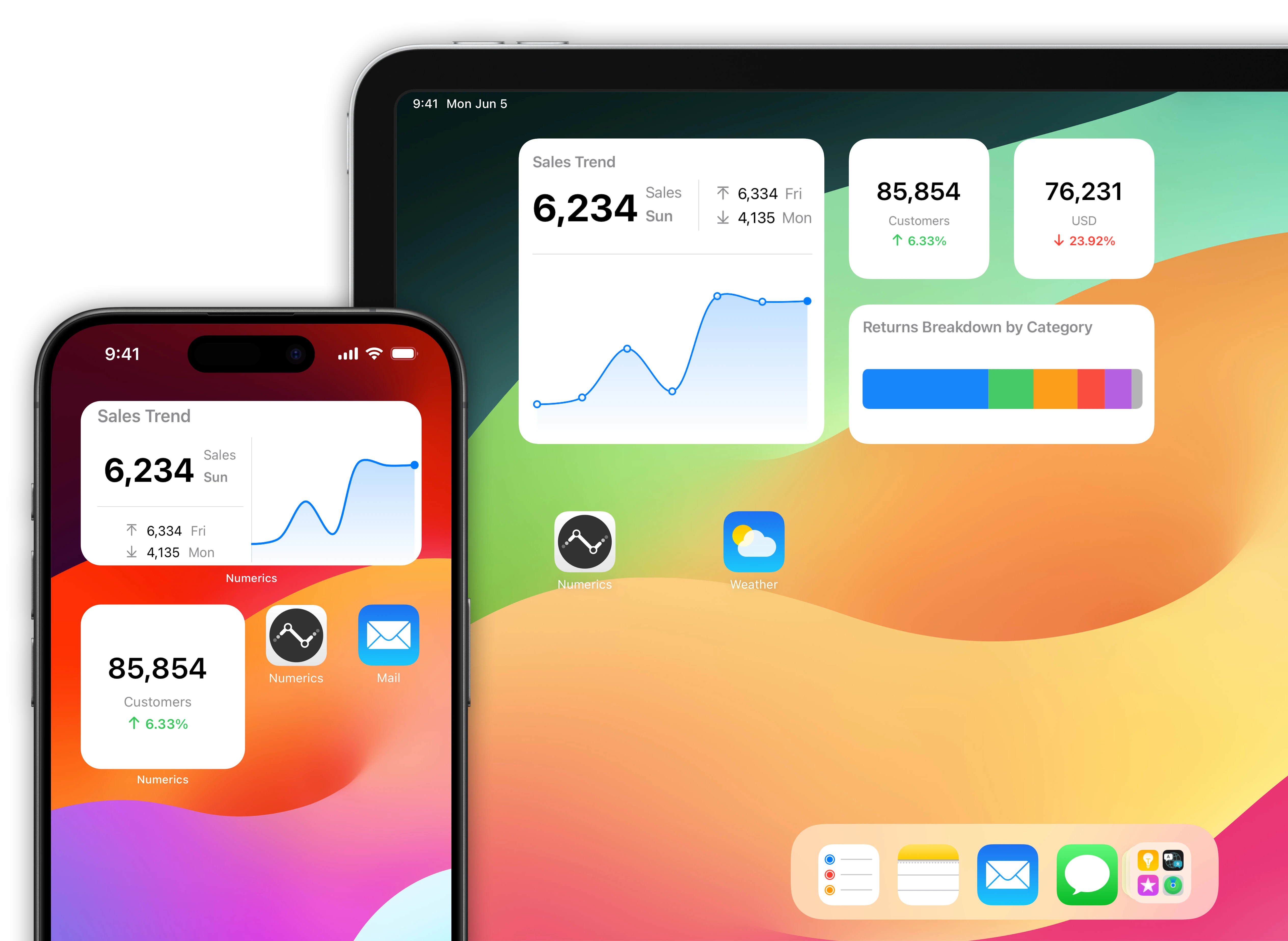
Gmail data driven home screens for your iOS Devices.
Native home screen widgets for your iPad & iPhone powered by data from your Gmail account.
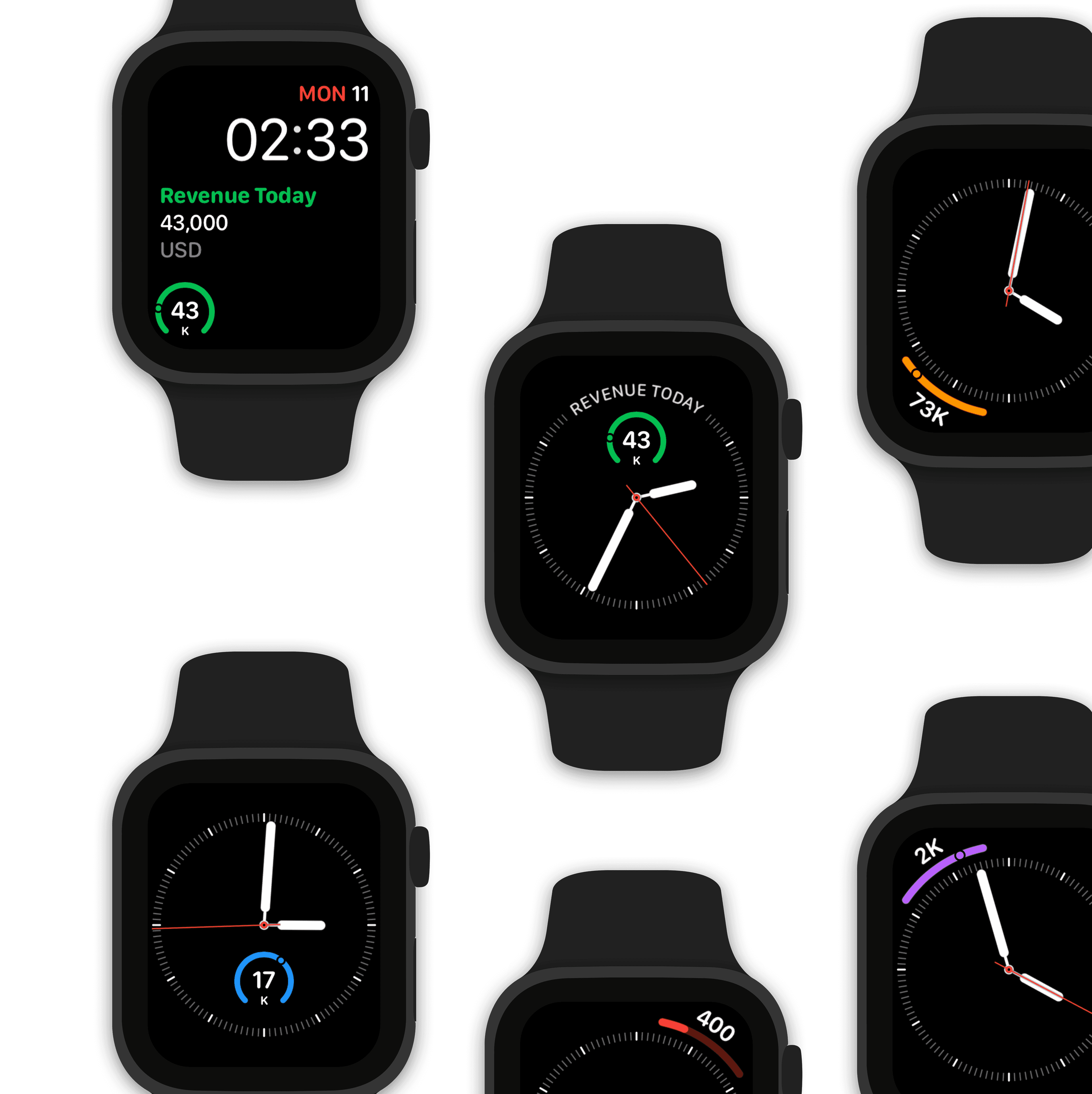
Watch complications for your Apple Watch faces.
Design a custom team performance watch face using Gmail data.
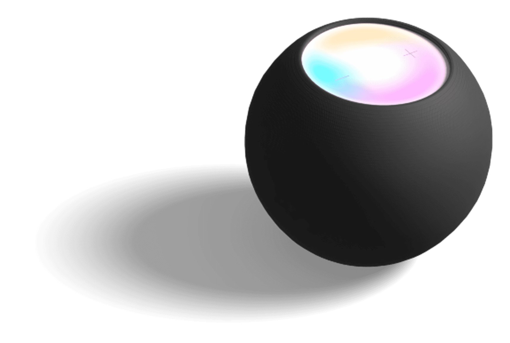
Make Siri Gmail data aware!
"Hey Siri, what are total chat threads?"
The value of total chat threads is 142 threads.
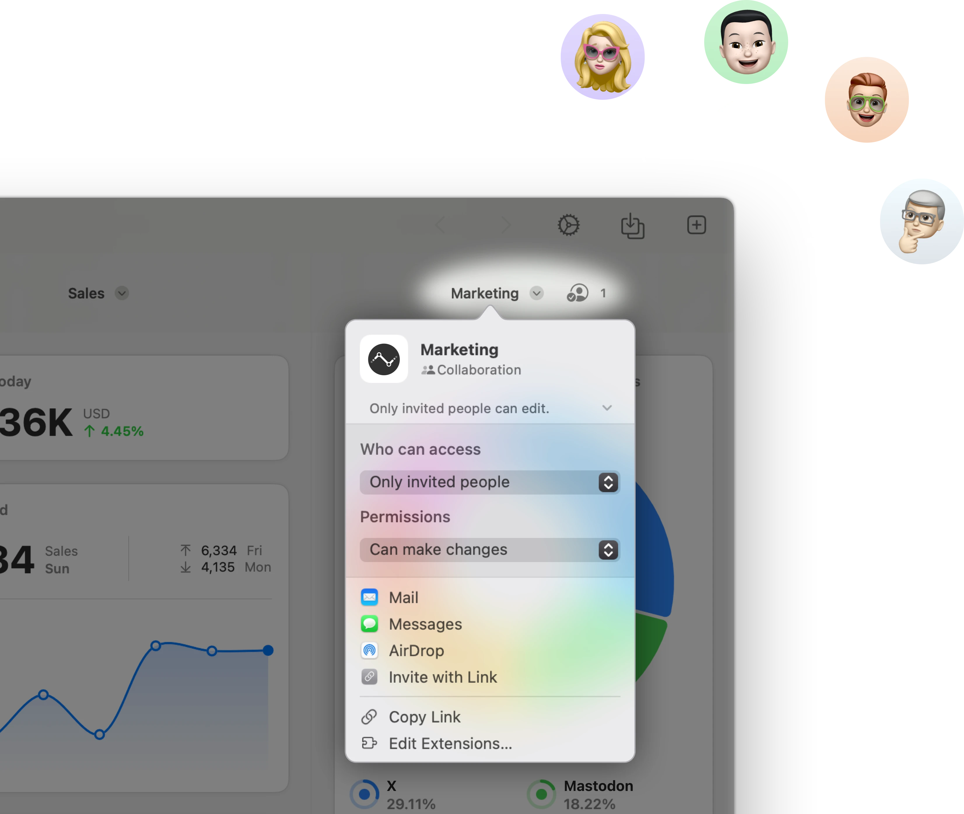
Stream & share Gmail KPIs with other users.
Stream a team performance dashboard to other Numerics users & co-create dashboards with your team in real-time via secure iCloud sharing & collaboration with Messages.
Related Documents:

Related Blog Posts:
Gmail Integration Specifications:
Widget Templates:
74
Authentication Type:
OAuth 2.0
Supported plans:
All
API Rate limit:
250 requests per second
Gmail Integration Specifications:
Widget Templates:
74
Authentication Type:
OAuth 2.0
Supported plans:
All
API Rate limit:
250 requests per second
Gmail Integration Specifications:
Widget Templates:
74
Authentication Type:
OAuth 2.0
Supported plans:
All
API Rate limit:
250 requests per second
Related Integrations


Users ❤️ Numerics
Users ❤️ Numerics
Customer Spotlight
Phil Steadman, VP of Operations - Ajax Mazda explains how they use Numerics across their 5 dealerships in Ontario, Canada.
Reviews from the App Store:
Reviews from the App Store:
A vital app for all businesses
I run a startup company and Numerics is vital for me to keep track of all business related statistics such as webpage analytics, Facebook and Twitter followers - even internal performance indicators from Google docs.
Tomas Ahlström
Sweden
Excellent!!!
One of the best tools for marketers!!! La aplicación es excelente y me ayuda para ver cómo van los números en mi comunidad.
KreatikOz
United States
Spectacular
The best implementation of just about every form of statistical data any tech could hope for. Love it!
Not a wb
United States
Best ever!
Best dashboard app ever = fast, easy & affordable!
Zipfelmuetze
Switzerland
Absolutely love it
Highly recommended, super easy, and a good set of integrations. Alot of other dashboard solutions are too costly as a small business owner, this was the perfect fit.
Rod Alberta
Canada
Finally!!
Finally a good native monitoring app.
JustATaylor
Australia
A vital app for all businesses
I run a startup company and Numerics is vital for me to keep track of all business related statistics such as webpage analytics, Facebook and Twitter followers - even internal performance indicators from Google docs.
Tomas Ahlström
Sweden
Absolutely love it
Highly recommended, super easy, and a good set of integrations. Alot of other dashboard solutions are too costly as a small business owner, this was the perfect fit.
Rod Alberta
Canada
Best ever!
Best dashboard app ever = fast, easy & affordable!
Zipfelmuetze
Switzerland
Spectacular
The best implementation of just about every form of statistical data any tech could hope for. Love it!
Not a wb
United States
Excellent!!!
One of the best tools for marketers!!! La aplicación es excelente y me ayuda para ver cómo van los números en mi comunidad.
KreatikOz
United States
Finally!!
Finally a good native monitoring app.
JustATaylor
Australia
A vital app for all businesses
I run a startup company and Numerics is vital for me to keep track of all business related statistics such as webpage analytics, Facebook and Twitter followers - even internal performance indicators from Google docs.
Tomas Ahlström
Sweden
Spectacular
The best implementation of just about every form of statistical data any tech could hope for. Love it!
Not a wb
United States
Absolutely love it
Highly recommended, super easy, and a good set of integrations. Alot of other dashboard solutions are too costly as a small business owner, this was the perfect fit.
Rod Alberta
Canada
Excellent!!!
One of the best tools for marketers!!! La aplicación es excelente y me ayuda para ver cómo van los números en mi comunidad.
KreatikOz
United States
Best ever!
Best dashboard app ever = fast, easy & affordable!
Zipfelmuetze
Switzerland
Finally!!
Finally a good native monitoring app.
JustATaylor
Australia
Get Numerics
Get started with your custom KPI dashboards for FREE!


Get Numerics
Get started with your custom KPI dashboards for FREE!
Get Numerics
Get started with your custom KPI dashboards for FREE!