Google Analytics 4 Dashboard Software
Google Analytics 4 dashboard app

Google Analytics 4 Dashboards

Track & share your Google Analytics 4 KPIs in real-time with the Numerics dashboard app for your iPhone, iPad, Mac, Apple TV and Apple Watch.


Numerics integrates with Google Analytics 4 to give you meaningful insights into your key web and app metrics like sessions, pageviews, conversions, retention and more. Track high level KPIs from Google Analytics 4 to improve visitor engagement and evaluate campaign success.

With Numerics, you never lose sight of how your web properties, campaigns, and goals are performing. Now focus on the KPIs that matter most and make data-driven decisions anywhere, every time!

Google Analytics 4 is an analytics service that enables you to measure traffic and engagement across your websites and apps.

159

Pre-built Google Analytics 4 KPI Templates.

Easy-to-use widget templates that serve as the building blocks to customizing your Google Analytics 4 dashboard.

Easy custom marketing dashboard design.

Connect with your Google Analytics 4 account and create your own dashboards in minutes. No coding or training is required.

Google Analytics 4 Dashboard Setup Guide

Secure, direct device-to-Google Analytics 4 connections.

The only Google Analytics 4 Dashboard tool on the planet that does not replicate your data and connects to the Google Analytics 4 servers directly from your devices. No intermediary cloud servers, secure by design.

KPIs & Key Metrics for Google Analytics 4 Dashboards

Build live marketing dashboards using the pre-designed Google Analytics 4 dashboard widgets or KPI templates listed below.

Reports Snapshot

Dashboard Visualization Type: Line Graph.

Active users trend

The trend of distinct users who visited your site or app within your chosen time span plotted on a line graph.

Dashboard Visualization Type: Text Label.

Average engagement time

The total amount of time per active user your website or app was in the foreground of users’ devices within your chosen time span.

Dashboard Visualization Type: Line Graph.

Average engagement time trend

The trend of time per active user your website or app was in the foreground of users’ devices within your chosen time span plotted on a line graph.

Dashboard Visualization Type: Number.

New users

The total number of users who interacted with your site or launched your app for the first time within your chosen time span.

Dashboard Visualization Type: Line Graph.

New users trend

The trend of users who interacted with your site or launched your app for the first time within your chosen time span plotted on a line graph.

Dashboard Visualization Type: Number.

Total revenue

The sum of revenue from purchases, subscriptions and advertising within your chosen time span.

Realtime

Dashboard Visualization Type: Number.

Conversions

The total number of times your users triggered a conversion event in last 30 minutes.

Dashboard Visualization Type: Pie Chart.

Conversions by device category

The conversions broken down by the devices they used in last 30 minutes.

Dashboard Visualization Type: Number.

Event count

The total number of times your users triggered an event in last 30 minutes.

Dashboard Visualization Type: Pie Chart.

Events by device category

The events broken down by the devices users used in last 30 minutes.

Dashboard Visualization Type: Top List.

Top audience by conversion count

The top audiences to which users belong ordered by conversion count in last 30 minutes.

Dashboard Visualization Type: Top List.

Top audience by user count

The top audiences to which users belong ordered by user count in last 30 minutes.

User Acquisition

Dashboard Visualization Type: Line Graph.

New users by first user default channel group trend

The trend of new users by the default channel group that first acquired the user plotted on a line graph within your chosen time span.

Dashboard Visualization Type: Top List.

Top sources by average engagement time

The top sources ordered by average engagement time within your chosen time span.

Dashboard Visualization Type: Top List.

Top sources by conversion count

The top sources ordered by conversion count within your chosen time span.

Dashboard Visualization Type: Top List.

Top sources by engaged session count

The top sources ordered by engaged session count within your chosen time span.

Dashboard Visualization Type: Top List.

Top sources by engaged sessions per user

The top sources ordered by engaged sessions per user within your chosen time span.

Dashboard Visualization Type: Top List.

Top sources by engagement rate

The top sources ordered by engagement rate within your chosen time span.

Traffic Acquisition

Dashboard Visualization Type: Top List.

Top sources by average engagement time per session

The top sources ordered by average engagement time per session within your chosen time span.

Dashboard Visualization Type: Top List.

Top sources by conversion count

The top sources ordered by conversion count within your chosen time span.

Dashboard Visualization Type: Top List.

Top sources by engaged session count

The top sources ordered by engaged session count within your chosen time span.

Dashboard Visualization Type: Top List.

Top sources by engaged sessions per user

The top sources ordered by engaged sessions per user within your chosen time span.

Dashboard Visualization Type: Top List.

Top sources by engagement rate per session

The top sources ordered by engagement rate per session within your chosen time span.

Dashboard Visualization Type: Top List.

Top sources by event count

The top sources ordered by event count within your chosen time span.

Engagement Overview

Dashboard Visualization Type: Number.

Engaged sessions per user

The number of sessions that lasted longer than 10 seconds, or had a conversion event, or had 2 or more screen views per active user within your chosen time span.

Dashboard Visualization Type: Line Graph.

Engaged sessions per user trend

The trend of sessions that lasted longer than 10 seconds, or had a conversion event, or had 2 or more screen views per active user within your chosen time span plotted on a line graph.

Dashboard Visualization Type: Number.

Event count

The total number of events within your chosen time span.

Dashboard Visualization Type: Line Graph.

Events trend

The trend of events within your chosen time span plotted on a line graph.

Dashboard Visualization Type: Line Graph.

User activity trend

The trend of user activity within your chosen time span plotted on a line graph.

Dashboard Visualization Type: Line Graph.

User stickiness trend

The trend of user stickiness within your chosen time span plotted on a line graph.

Engagement Events

Dashboard Visualization Type: Line Graph.

Event count by event name trend

The trend of events within your chosen time span plotted on a line graph.

Dashboard Visualization Type: Top List.

Top events by event count

The top events ordered by event count within your chosen time span.

Dashboard Visualization Type: Top List.

Top events by event count per user

The top events ordered by event count per user within your chosen time span.

Dashboard Visualization Type: Top List.

Top events by revenue

The top events ordered by sum of revenue from purchases, subscriptions, and advertising within your chosen time span.

Dashboard Visualization Type: Top List.

Top events by user count

The top events ordered by total user count within your chosen time span.

Engagement Conversions

Dashboard Visualization Type: Line Graph.

Conversions by event name trend

The trend of conversions within your chosen time span plotted on a line graph.

Dashboard Visualization Type: Top List.

Top events by conversions

The top triggered events ordered by conversion count within your chosen time span.

Dashboard Visualization Type: Top List.

Top events by revenue

The top triggered events ordered by total revenue within your chosen time span.

Engagement Pages And Screens

Dashboard Visualization Type: Top List.

Top page/screen by average engagement time

The top pages or screens ordered by the average length of time that the app was in the foreground, or the web site had focus in the browser within your chosen time span.

Dashboard Visualization Type: Top List.

Top page/screen by conversion count

The top pages or screens ordered by conversion count within your chosen time span.

Dashboard Visualization Type: Top List.

Top page/screen by event count

The top pages or screens ordered by event count within your chosen time span.

Dashboard Visualization Type: Top List.

Top page/screen by revenue

The top pages or screens ordered by total revenue within your chosen time span.

Dashboard Visualization Type: Top List.

Top page/screen by view count

The top pages or screens ordered by view count within your chosen time span.

Dashboard Visualization Type: Top List.

Top page/screen by view per user

The top pages or screens ordered by the average number of mobile app screens or web pages viewed per user within your chosen time span.

Engagement Landing Page

Dashboard Visualization Type: Line Graph.

Sessions by landing page trend

The trend of sessions by landing pages within your chosen time span plotted on a line graph.

Dashboard Visualization Type: Top List.

Top landing pages by average engagement time per session

The top landing pages ordered by user engagement duration per session within your chosen time span.

Dashboard Visualization Type: Top List.

Top landing pages by conversions

The top landing pages ordered by conversion count within your chosen time span.

Dashboard Visualization Type: Top List.

Top landing pages by new user count

The top landing pages ordered by new user count within your chosen time span.

Dashboard Visualization Type: Top List.

Top landing pages by revenue

The top landing pages ordered by total revenue within your chosen time span.

Dashboard Visualization Type: Top List.

Top landing pages by session count

The top landing pages ordered by session count within your chosen time span.

Monetization Overview

Dashboard Visualization Type: Number.

Average purchase revenue per user

The average purchase revenue per user within your chosen time span.

Dashboard Visualization Type: Line Graph.

Average purchase revenue per user trend

The trend of average purchase revenue per user within your chosen time span plotted on a line graph.

Dashboard Visualization Type: Number.

First time purchasers

The total number of users that completed their first purchase event within your chosen time span.

Dashboard Visualization Type: Line Graph.

First time purchasers trend

The trend of total number of users that completed their first purchase event within your chosen time span plotted on a line graph.

Dashboard Visualization Type: Number.

Purchase revenue

The sum of revenue from purchases made in your app or site within your chosen time span.

Dashboard Visualization Type: Line Graph.

Purchase revenue trend

The trend of sum of revenue from purchases made in your app or site within your chosen time span plotted on a line graph.

Monetization Ecommerce Purchases

Dashboard Visualization Type: Line Graph.

Items viewed by item name trend

The trend of item views within your chosen time span plotted on a line graph.

Dashboard Visualization Type: Top List.

Top items by added to cart

The top item names ordered by added to cart count within your chosen time span.

Dashboard Visualization Type: Top List.

Top items by purchase count

The top item names ordered by purchase count within your chosen time span.

Dashboard Visualization Type: Top List.

Top items by revenue

The top item names ordered by item revenue within your chosen time span.

Dashboard Visualization Type: Top List.

Top items by view count

The top item names ordered by view count within your chosen time span.

Monetization Publisher Ads

Dashboard Visualization Type: Line Graph.

Publisher ad impressions by ad unit trend

The trend of the number of ad_impression events by ad unit within your chosen time span plotted on a line graph.

Dashboard Visualization Type: Top List.

Top ad units by click count

The top ad units ordered by the number of ad_click events within your chosen time span.

Dashboard Visualization Type: Top List.

Top ad units by exposure

The top ad units ordered by the time that an ad unit was exposed to a user, in milliseconds within your chosen time span.

Dashboard Visualization Type: Top List.

Top ad units by impression count

The top ad units ordered by the number of ad_impression events within your chosen time span.

Dashboard Visualization Type: Top List.

Top ad units by revenue

The top ad units ordered by total ad revenue within your chosen time span.

User Demographics Overview

Dashboard Visualization Type: Pie Chart.

Returning users by gender

The returning users broken down by genders within your chosen time span.

Dashboard Visualization Type: Top List.

Top cities by returning user count

The top 5 cities ordered by returning user count within your chosen time span.

Dashboard Visualization Type: Top List.

Top cities by user count

The top cities ordered by user count within your chosen time span.

Dashboard Visualization Type: Top List.

Top countries by returning user count

The top 5 countries ordered by returning user count within your chosen time span.

Dashboard Visualization Type: Top List.

Top countries by user count

The top countries ordered by user count within your chosen time span.

Dashboard Visualization Type: Top List.

Top languages by user count

The top languages ordered by returning user count within your chosen time span.

Retention

Dashboard Visualization Type: Number.

Returning users

The total number of returning users within your chosen time span.

Dashboard Visualization Type: Line Graph.

Returning users trend

The trend of returning users within your chosen time span plotted on a line graph.

User Demographic Details

Dashboard Visualization Type: Top List.

Top demographics by average engagement time

The top chosen demographic sources ordered by average engagement time within your chosen time span.

Dashboard Visualization Type: Top List.

Top demographics by conversion count

The top chosen demographic sources ordered by conversion count within your chosen time span.

Dashboard Visualization Type: Top List.

Top demographics by engaged session count

The top chosen demographic sources ordered by engaged session count within your chosen time span.

Dashboard Visualization Type: Top List.

Top demographics by engaged sessions per user

The top chosen demographic sources ordered by engaged sessions per user within your chosen time span.

Dashboard Visualization Type: Top List.

Top demographics by engagement rate

The top chosen demographic sources ordered by engagement rate within your chosen time span.

Dashboard Visualization Type: Top List.

Top demographics by event count

The top chosen demographic sources ordered by event count within your chosen time span.

User Tech Overview

Dashboard Visualization Type: Pie Chart.

Returning users by device category

The returning users broken down by the type of device within your chosen time span.

Dashboard Visualization Type: Top List.

Top app versions by returning user count

The top app versions ordered by returning user count within your chosen time span.

Dashboard Visualization Type: Top List.

Top app versions by revenue

The top app versions ordered by total revenue within your chosen time span.

Dashboard Visualization Type: Top List.

Top app versions by user count

The top app versions ordered by user count within your chosen time span.

Dashboard Visualization Type: Top List.

Top browsers by returning user count

The top browsers used to view your website ordered by returning user count within your chosen time span.

Dashboard Visualization Type: Top List.

Top browsers by user count

The top browsers used to view your website ordered by user count within your chosen time span.

User Tech Details

Dashboard Visualization Type: Top List.

Top sources by average engagement time

The top sources ordered by average engagement time within your chosen time span.

Dashboard Visualization Type: Top List.

Top sources by conversion count

The top sources ordered by conversion count within your chosen time span.

Dashboard Visualization Type: Top List.

Top sources by engaged session count

The top sources ordered by engaged sessions within your chosen time span.

Dashboard Visualization Type: Top List.

Top sources by engaged sessions per user

The top sources ordered by engaged sessions per user within your chosen time span.

Dashboard Visualization Type: Top List.

Top sources by engagement rate

The top sources ordered by engagement rate within your chosen time span.

Dashboard Visualization Type: Top List.

Top sources by event count

The top sources ordered by event count within your chosen time span.

Google Analytics 4 Metrics Everywhere!

Have your KPIs & metrics break out of your marketing dashboard app into other parts of your devices.

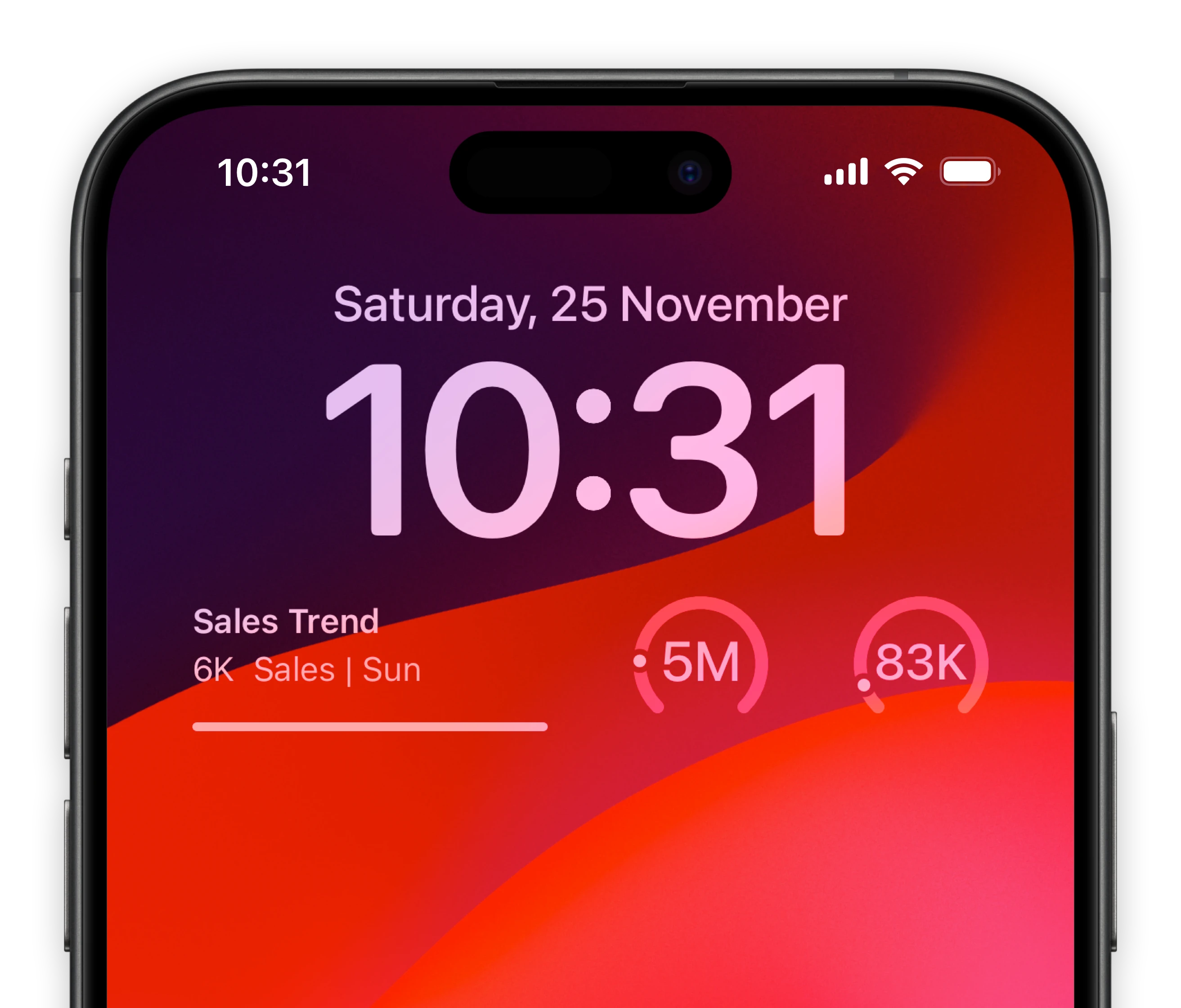
Lock-screen widgets on your iPhone.

Keep track of your most important email marketing metrics of Google Analytics 4 right from your iPhone lock screen.

Micro Google Analytics 4 dashboards for your iOS Lock-screens
A mini Google Analytics 4 dashboard for your MacOS Notification Center

Notification center widgets for your Mac.

Connect your Google Analytics 4 metrics to your MacOS sidebar.

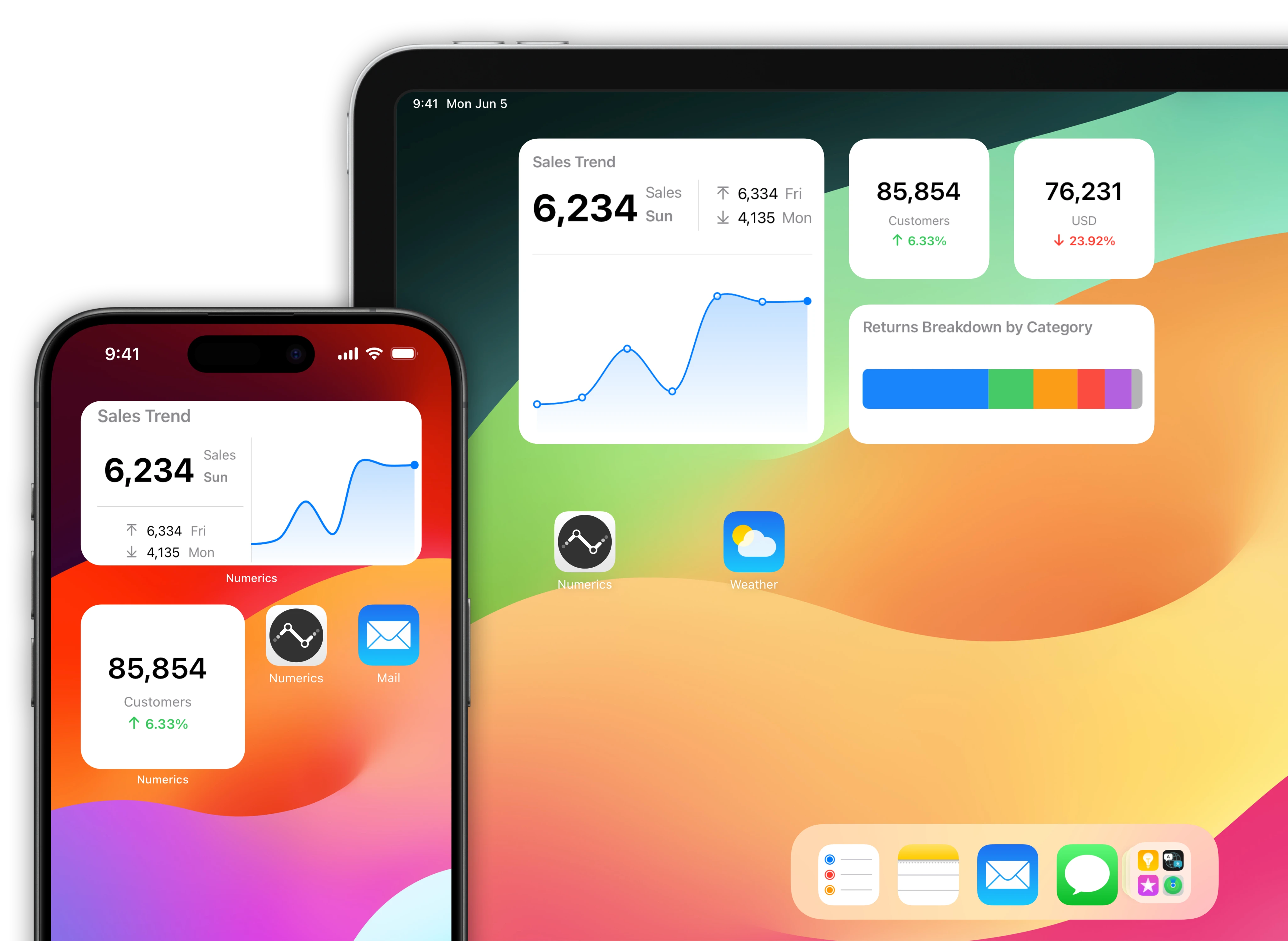
Google Analytics 4 data driven home screens for your iOS Devices.

Native home screen widgets for your iPad & iPhone powered by data from your Google Analytics 4 account.

A mini Google Analytics 4 dashboard for your iOS home screen

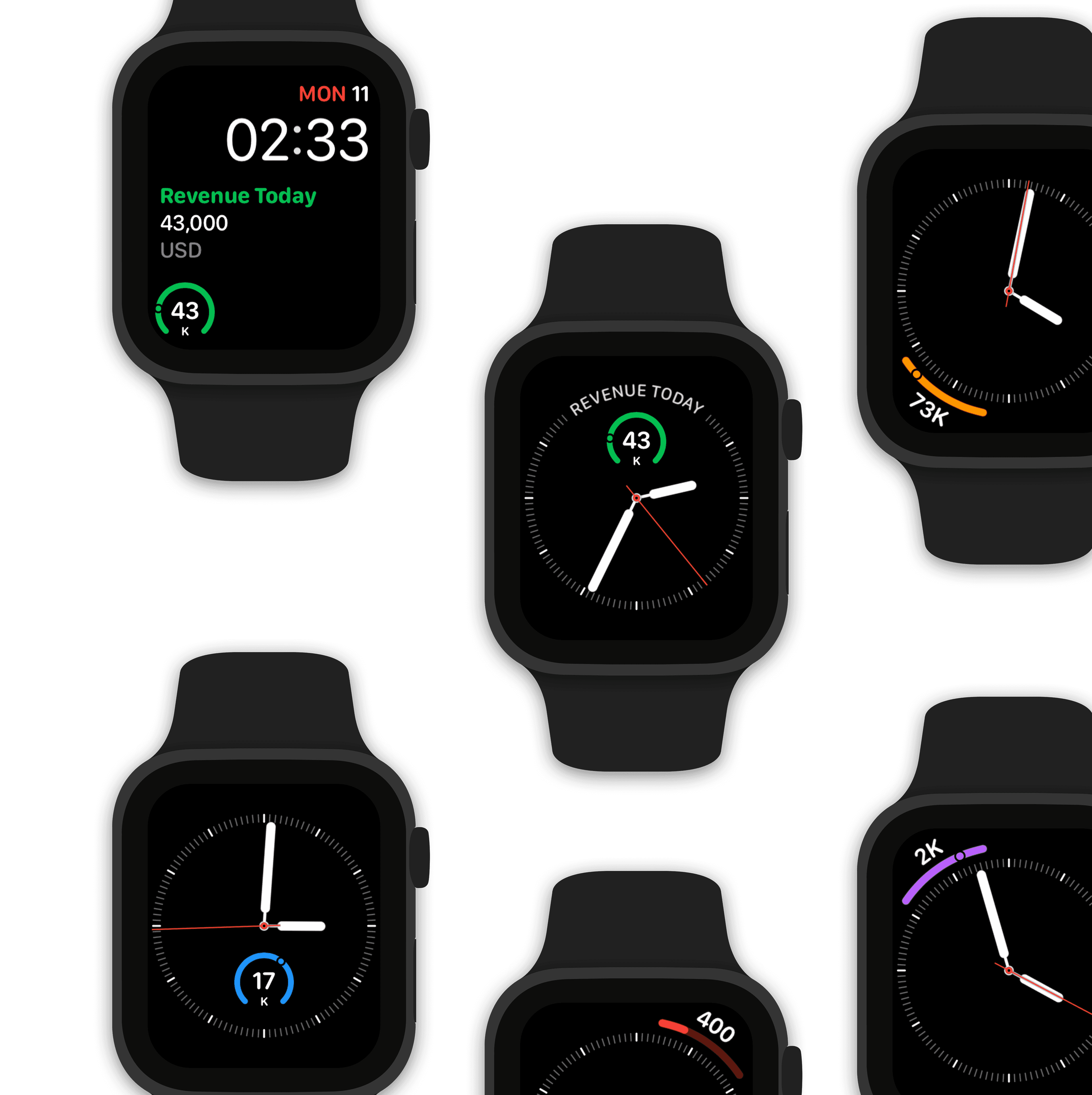
Watch complications for your Apple Watch faces.

Design a custom marketing watch face using Google Analytics 4 data.

Make Siri Google Analytics 4 data aware!

“Hey Siri, what’s the active users trend?"

“The latest value of active users trend is 34,219 users for 31 Mar 2023. This is at 8.1% of variation range across the period.”

Collaboratively build dashboards with teams in real-time

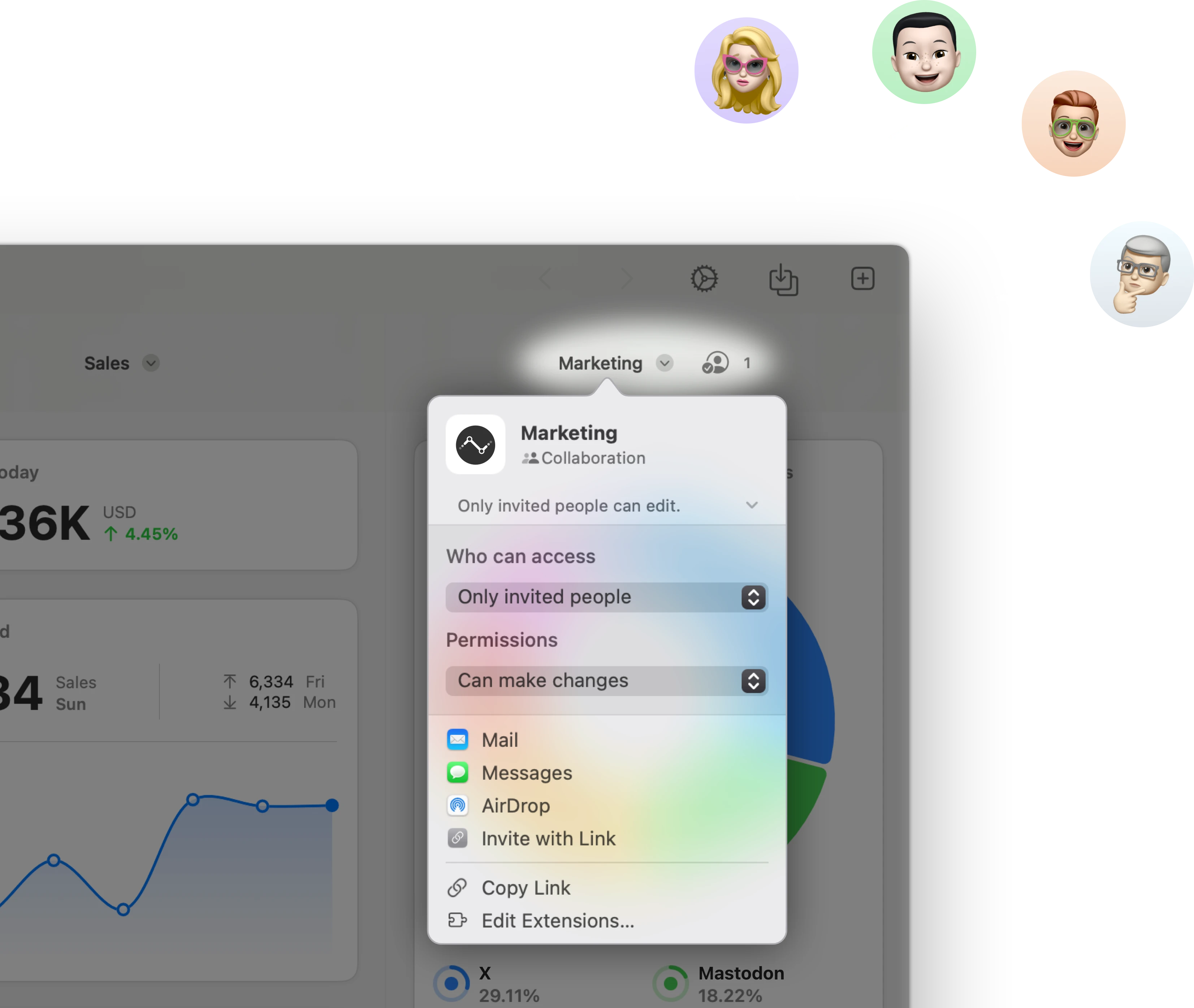
Stream & share Google Analytics 4 KPIs with other users.

Stream a marketing dashboard to other Numerics users & co-create dashboards with your team in real-time via secure iCloud sharing & collaboration with Messages.

Related Documents:

Related Blog Posts:

Google Analytics 4 Integration Specifications:

Google LLC Support:

Related Integrations

Appfigures Dashboards

Appfigures

Track important iOS & Android app statistics.

Flurry Dashboards

Flurry

Visualize and analyze user behavior of your iOS & Android mobile apps.

Intercom Dashboards

Intercom

Drive sales & support teams to achieve targets by tracking live user statistics.

Get Numerics

The KPI dashboard app

Numerics icon-ws
Numerics icon-ws