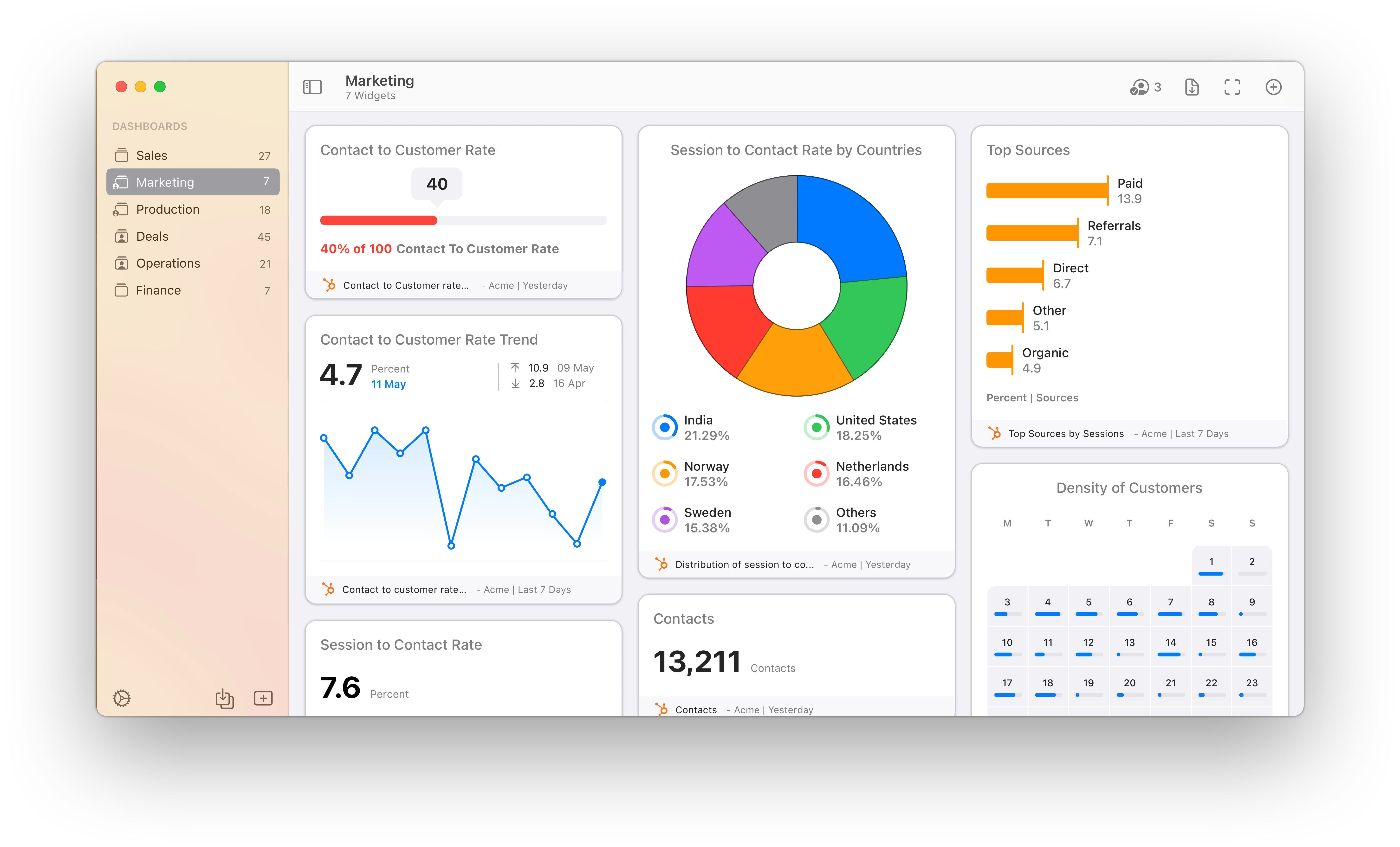
HubSpot Marketing Hub Dashboard Software
HubSpot Marketing Hub dashboard app

HubSpot Marketing Hub Dashboards

Track & share your HubSpot Marketing Hub KPIs in real-time with the Numerics dashboard app for your iPhone, iPad, Mac, Apple TV and Apple Watch.


Numerics integrates with HubSpot Marketing Hub to bring you powerful analytics and insights for your online marketing activities. With this integration, you can track and visualize the performance of your marketing activities and see how they are driving engagement and conversions. It also lets you combine business metrics from ActiveCampaign, Pipedrive, Google Analytics, Google Sheets & a variety of tools in your tech stack - into a unified, marketing dashboard that is glanceable and easy to understand.

With Numerics and HubSpot Marketing Hub, you’ll have all the information you need to understand how your commercial operations are performing, and make data-driven decisions to improve their performance. Enjoy privacy-first analytics and actionable insights, and take your performance to the next level with Numerics and HubSpot Marketing Hub!

HubSpot Marketing Hub Website Analytics Platform Logo

HubSpot Marketing Hub is a marketing software to help you grow traffic, convert more visitors, and run complete inbound marketing campaigns at scale.

262

Pre-built HubSpot Marketing Hub KPI Templates.

Easy-to-use widget templates that serve as the building blocks to customizing your HubSpot Marketing Hub dashboard.

Easy custom marketing dashboard design.

Connect with your HubSpot Marketing Hub account and create your own dashboards in minutes. No coding or training is required.

HubSpot Marketing Hub Dashboard Setup Guide

Secure, direct device-to-HubSpot Marketing Hub connections.

The only HubSpot Marketing Hub Dashboard tool on the planet that does not replicate your data and connects to the HubSpot Marketing Hub servers directly from your devices. No intermediary cloud servers, secure by design.

KPIs & Key Metrics for HubSpot Marketing Hub Dashboards

Build live marketing dashboards using the pre-designed HubSpot Marketing Hub dashboard widgets or KPI templates listed below.

Contacts

Dashboard Visualization Type: Number.

Contacts

The total number of contacts for your chosen analytics view within your chosen time span.

Dashboard Visualization Type: Line Graph.

Contacts by trend

The trend of contacts for your chosen analytics view within your chosen time span plotted on a line graph.

Dashboard Visualization Type: Month Density.

Density of contacts

The day density calendar widget for contacts for your chosen analytics view within your chosen time span.

Dashboard Visualization Type: Pie Chart.

Distribution of contacts by countries

The contacts broken down by countries for your chosen analytics view within your chosen time span.

Dashboard Visualization Type: Number.

Contacts by sources

The total number of contacts by sources for your chosen analytics view within your chosen time span.

Dashboard Visualization Type: Line Graph.

Contacts by sources trend

The trend of contacts by sources for your chosen analytics view within your chosen time span plotted on a line graph.

Conversions

Dashboard Visualization Type: Number.

Contact to customer rate

The total number of contact to customer rate for your chosen analytics view within your chosen time span.

Dashboard Visualization Type: Line Graph.

Contact to customer rate trend

The trend of contact to customer rate for your chosen analytics view within your chosen time span plotted on a line graph.

Dashboard Visualization Type: Gauge.

Contact to customer rate gauge

The gauge for the contact to customer rate for your chosen analytics view within your chosen time span.

Dashboard Visualization Type: Number.

Contact to customer rate by sources

The total number of contact to customer rate by sources for your chosen analytics view within your chosen time span.

Dashboard Visualization Type: Line Graph.

Contact to customer rate by sources trend

The trend of contact to customer rate by sources for your chosen analytics view within your chosen time span plotted on a line graph.

Dashboard Visualization Type: Pie Chart.

Distribution of contact to customer rate by sources

The contact to customer rate broken down by sources for your chosen analytics view within your chosen time span.

Customers

Dashboard Visualization Type: Number.

Customers

The total number of customers for your chosen analytics view within your chosen time span.

Dashboard Visualization Type: Number.

Customers by sources

The total number of customers by sources for your chosen analytics view within your chosen time span.

Dashboard Visualization Type: Line Graph.

Customers by sources trend

The trend of customers by sources for your chosen analytics view within your chosen time span plotted on a line graph.

Dashboard Visualization Type: Number.

Customers per page view

The total number of customers per page view for your chosen analytics view within your chosen time span.

Dashboard Visualization Type: Number.

Customers per page view by sources

The total number of customers per page view by sources for your chosen analytics view within your chosen time span.

Dashboard Visualization Type: Line Graph.

Customers per page view by sources trend

The trend of customers per page view by sources for your chosen analytics view within your chosen time span plotted on a line graph.

Form Submissions

Dashboard Visualization Type: Month Density.

Density of non contact submissions

The day density calendar widget for total non contact submissions for your chosen analytics view.

Dashboard Visualization Type: Month Density.

Density of privacy consent approves

The day density calendar widget for total privacy consent approves for your chosen analytics view.

Dashboard Visualization Type: Month Density.

Density of privacy consent declines

The day density calendar widget for total privacy consent declines for your chosen analytics view.

Dashboard Visualization Type: Month Density.

Density of submissions

The day density calendar widget for total submissions for your chosen analytics view.

Dashboard Visualization Type: Month Density.

Density of submissions per page view

The day density calendar widget for total submissions per page view for your chosen analytics view.

Dashboard Visualization Type: Number.

Non contact submissions

The total number of non contact submissions for your chosen analytics view within your chosen time span.

Leads

Dashboard Visualization Type: Month Density.

Density of leads

The day density calendar widget for total leads for your chosen analytics view.

Dashboard Visualization Type: Month Density.

Density of leads by sources

The day density calendar widget for leads by sources for your chosen analytics view.

Dashboard Visualization Type: Month Density.

Density of leads per view

The day density calendar widget for leads per view for your chosen analytics view.

Dashboard Visualization Type: Month Density.

Density of leads per view by sources

The day density calendar widget for leads per view by sources for your chosen analytics view.

Dashboard Visualization Type: Month Density.

Density of marketing qualified leads

The day density calendar widget for marketing qualified leads for your chosen analytics view.

Dashboard Visualization Type: Month Density.

Density of sales qualified leads

The day density calendar widget for sales qualified leads for your chosen analytics view.

Opportunities

Dashboard Visualization Type: Month Density.

Density of opportunities

The day density calendar widget for total opportunities for your chosen analytics view.

Dashboard Visualization Type: Month Density.

Density of opportunities by sources

The day density calendar widget for total opportunities by sources for your chosen analytics view.

Dashboard Visualization Type: Pie Chart.

Distribution of opportunities by countries

The opportunities broken down by countries for your chosen analytics view within your chosen time span.

Dashboard Visualization Type: Pie Chart.

Distribution of opportunities by sources

The opportunities broken down by sources for your chosen analytics view within your chosen time span.

Dashboard Visualization Type: Number.

Opportunities

The number of opportunities for your chosen analytics view within your chosen time span.

Dashboard Visualization Type: Number.

Opportunities by sources

The number of opportunities by sources for your chosen analytics view within your chosen time span.

Page views

Dashboard Visualization Type: Gauge.

Bounce rate by country gauge

The gauge for the number of bounce rate by countries for your chosen analytics view within your chosen time span.

Dashboard Visualization Type: Number.

Bounce rate by sources

The total number of bounce rate by sources for your chosen analytics view within your chosen time span.

Dashboard Visualization Type: Gauge.

Bounce rate by sources gauge

The gauge for the number of bounce rate by sources for your chosen analytics view within your chosen time span.

Dashboard Visualization Type: Line Graph.

Bounce rate by sources trend

The trend of bounce rate by sources for your chosen analytics view within your chosen time span plotted on a line graph.

Dashboard Visualization Type: Gauge.

Bounce rate by UTM type gauge

The gauge for the number of bounce rate by UTM types for your chosen analytics view within your chosen time span.

Dashboard Visualization Type: Number.

Bounces by sources

The total number of bounces by sources for your chosen analytics view within your chosen time span.

Sessions

Dashboard Visualization Type: Month Density.

Density of time per session by sources

The The day density calendar widget for time per session by sources for your chosen analytics view within your chosen time span.

Dashboard Visualization Type: Month Density.

Density of time spent by sources

The The day density calendar widget for time spent by sources for your chosen analytics view within your chosen time span.

Dashboard Visualization Type: Pie Chart.

Distribution of desktop traffic by sessions

The desktop traffic broken down by sessions for your chosen analytics view within your chosen time span.

Dashboard Visualization Type: Pie Chart.

Distribution of direct traffic by sessions

The direct traffic broken down by sessions for your chosen analytics view within your chosen time span.

Dashboard Visualization Type: Pie Chart.

Distribution of mobile traffic by sessions

The mobile traffic broken down by sessions for your chosen analytics view within your chosen time span.

Dashboard Visualization Type: Pie Chart.

Distribution of organic searches by sessions

The organic searches broken down by sessions for your chosen analytics view within your chosen time span.

Subscribers

Dashboard Visualization Type: Month Density.

Density of subscribers

The The day density calendar widget for subscribers for your chosen analytics view within your chosen time span.

Dashboard Visualization Type: Month Density.

Density of subscribers by sources

The The day density calendar widget for subscribers by sources for your chosen analytics view within your chosen time span.

Dashboard Visualization Type: Pie Chart.

Distribution of subscribers by sources

The subscribers broken down by sources for your chosen analytics view within your chosen time span.

Dashboard Visualization Type: Number.

Subscribers

The total number of subscribers for your chosen analytics view within your chosen time span.

Dashboard Visualization Type: Number.

Subscribers by sources

The total number of subscribers by sources for your chosen analytics view within your chosen time span.

Dashboard Visualization Type: Line Graph.

Subscribers by sources trend

The trend of subscribers by sources for your chosen analytics view within your chosen time span plotted on a line graph.

Views

Dashboard Visualization Type: Month Density.

Density of raw views

The The day density calendar widget for raw views for your chosen analytics view within your chosen time span.

Dashboard Visualization Type: Month Density.

Density of raw views by sources

The The day density calendar widget for raw views by sources for your chosen analytics view within your chosen time span.

Dashboard Visualization Type: Month Density.

Density of standard views

The The day density calendar widget for standard views for your chosen analytics view within your chosen time span.

Dashboard Visualization Type: Month Density.

Density of standard views by sources

The The day density calendar widget for standard views by sources for your chosen analytics view within your chosen time span.

Dashboard Visualization Type: Pie Chart.

Distribution of raw views by countries

The raw views broken down by countries for your chosen analytics view within your chosen time span.

Dashboard Visualization Type: Pie Chart.

Distribution of raw views by sources

The raw views broken down by sources for your chosen analytics view within your chosen time span.

Visitors

Dashboard Visualization Type: Month Density.

Density of visitors

The The day density calendar widget for visitors for your chosen analytics view within your chosen time span.

Dashboard Visualization Type: Month Density.

Density of visitors by sources

The The day density calendar widget for visitors by sources for your chosen analytics view within your chosen time span.

Dashboard Visualization Type: Pie Chart.

Distribution of new visitor session rate by countries

The new visitor session rate broken down by countries for your chosen analytics view within your chosen time span.

Dashboard Visualization Type: Pie Chart.

Distribution of new visitor session rate by sources

The new visitor session rate broken down by sources for your chosen analytics view within your chosen time span.

Dashboard Visualization Type: Pie Chart.

Distribution of visitors by countries

The visitors broken down by countries for your chosen analytics view within your chosen time span.

Dashboard Visualization Type: Pie Chart.

Distribution of visitors rate by sources

The visitors broken down by sources for your chosen analytics view within your chosen time span.

Visits

Dashboard Visualization Type: Month Density.

Density of returning visits

The The day density calendar widget for returning visits for your chosen analytics view within your chosen time span.

Dashboard Visualization Type: Month Density.

Density of returning visits by sources

The The day density calendar widget for returning visits by sources for your chosen analytics view within your chosen time span.

Dashboard Visualization Type: Month Density.

Density of visits

The The day density calendar widget for visits for your chosen analytics view within your chosen time span.

Dashboard Visualization Type: Month Density.

Density of visits by sources

The The day density calendar widget for visits by sources for your chosen analytics view within your chosen time span.

Dashboard Visualization Type: Pie Chart.

Distribution of returning visits by countries

The returning visits broken down by countries for your chosen analytics view within your chosen time span.

Dashboard Visualization Type: Pie Chart.

Distribution of returning visits by sources

The returning visits broken down by sources for your chosen analytics view within your chosen time span.

HubSpot Marketing Hub Metrics Everywhere!

Have your KPIs & metrics break out of your marketing dashboard app into other parts of your devices.

Lock-screen widgets on your iPhone.

Keep track of your most important digital marketing metrics of HubSpot Marketing Hub right from your iPhone lock screen.

Micro HubSpot Marketing Hub dashboards for your iOS Lock-screens
A mini HubSpot Marketing Hub dashboard for your MacOS Notification Center

Notification center widgets for your Mac.

Connect your HubSpot Marketing Hub metrics to your MacOS sidebar.

HubSpot Marketing Hub data driven home screens for your iOS Devices.

Native home screen widgets for your iPad & iPhone powered by data from your HubSpot Marketing Hub account.

A mini HubSpot Marketing Hub dashboard for your iOS home screen

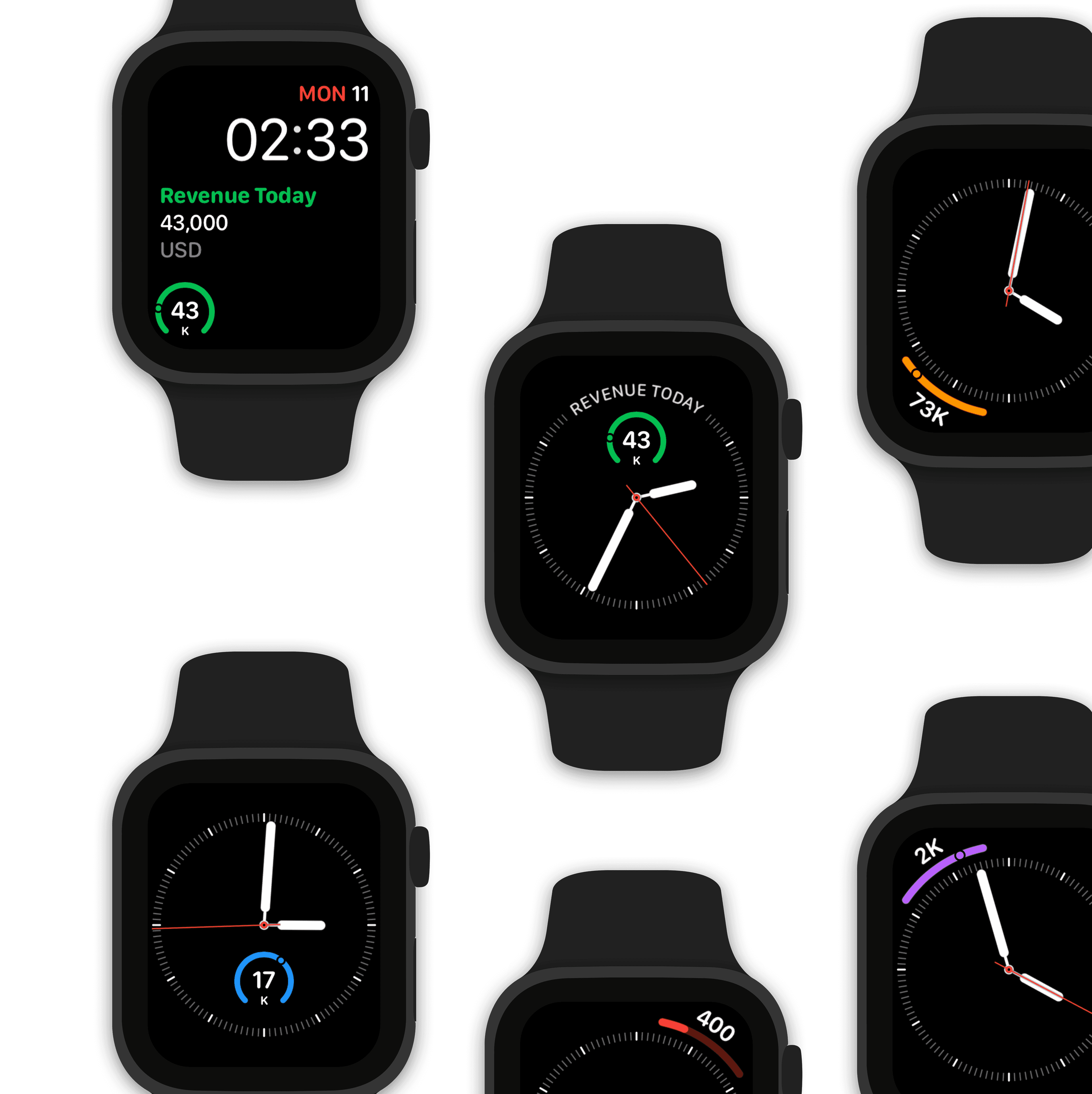
Watch complications for your Apple Watch faces.

Design a custom marketing watch face using HubSpot Marketing Hub data.
Make Siri HubSpot Marketing Hub data aware!

“Hey Siri, what’s the leads trend?"

“The latest value of leads trend is 7832 leads for 31 Mar 2023. This is at 4.5% of variation range across the period.”

Collaboratively build dashboards with teams in real-time

Stream & share HubSpot Marketing Hub KPIs with other users.

Stream a marketing dashboard to other Numerics users & co-create dashboards with your team in real-time via secure iCloud sharing & collaboration with Messages.

Related Documents:

Related Blog Posts:

HubSpot Marketing Hub Integration Specifications:

Hubspot, Inc. Support:

Related Integrations

Appfigures Dashboards

Appfigures

Track important iOS & Android app statistics.

Flurry Dashboards

Flurry

Visualize and analyze user behavior of your iOS & Android mobile apps.

Intercom Dashboards

Intercom

Drive sales & support teams to achieve targets by tracking live user statistics.

Get Numerics

The KPI dashboard app

Numerics icon-ws
Numerics icon-ws