Pingdom Dashboard Software
Pingdom dashboard app

Pingdom Dashboards

Track & share your Pingdom KPIs in real-time with the Numerics dashboard app for your iPhone, iPad, Mac, Apple TV and Apple Watch.


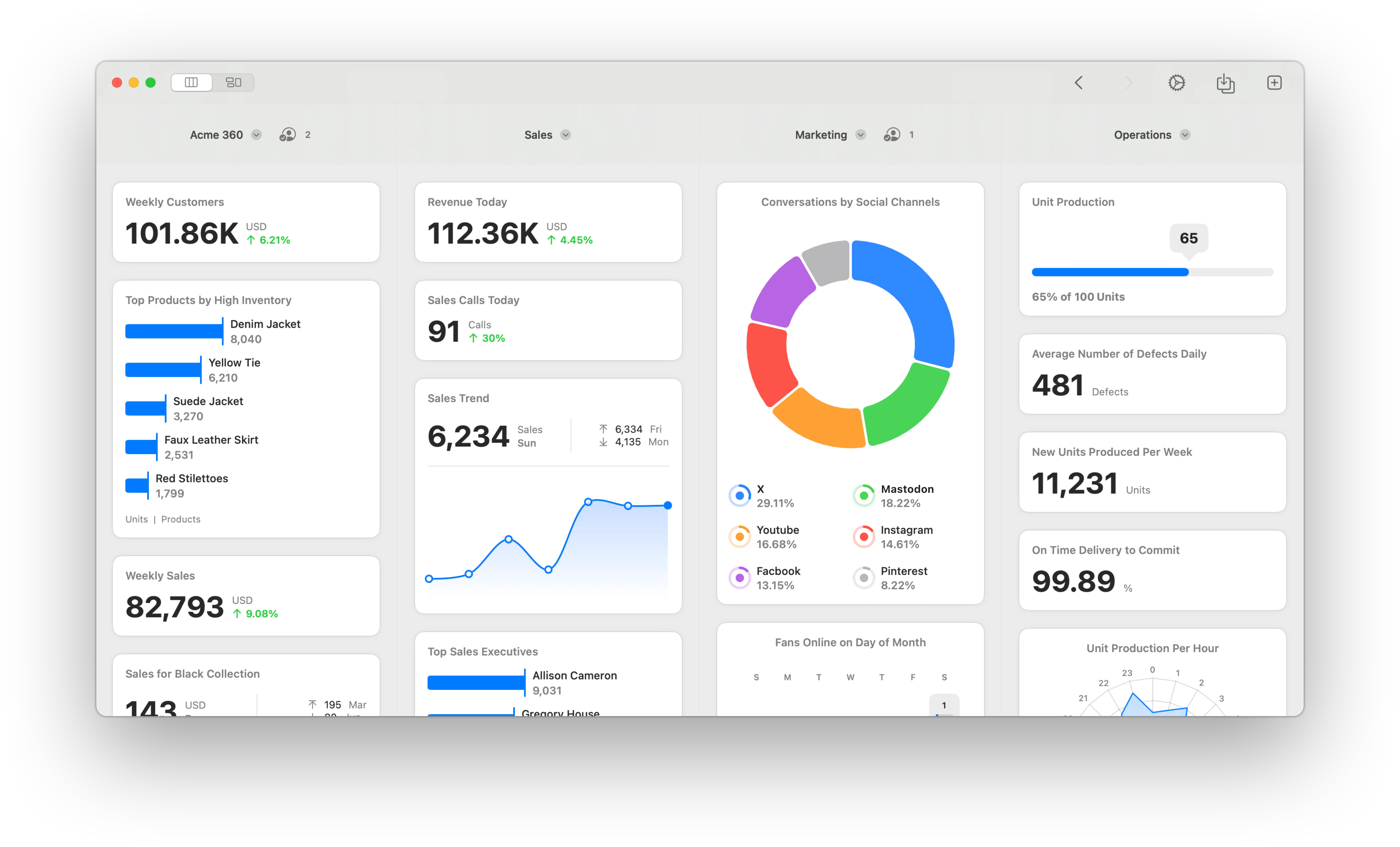
Numerics integrates with Pingdom to bring monitoring and performance insights right to your fingertips. With this integration, you can easily track and visualize the performance of your website, servers, and applications in real-time. Numerics aggregates data from ActiveCampaign, Pipedrive, Google Analytics, Google Sheets & a variety of tools in your tech stack - into a unified, infrastructure monitoring dashboard that is glanceable and easy to understand.

With Numerics, you never lose sight of how your website, servers, and applications are performing. Now focus on the KPIs that matter most and make data-driven decisions anywhere, every time!

Pingdom Website Monitoring Platform Logo

Pingdom is a cost-effective and reliable uptime and performance monitoring tool for your website. It use more than 70 global polling locations to test and verify your customers’ websites 24/7, all year long. With Pingdom you can monitor your websites’ uptime, performance, and interactions for a better end-user-experience.

16

Pre-built Pingdom KPI Templates.

Easy-to-use widget templates that serve as the building blocks to customizing your Pingdom dashboard.

Easy custom Dev Ops dashboard design.

Connect with your Pingdom account and create your own dashboards in minutes. No coding or training is required.

Pingdom Dashboard Setup Guide

Secure, direct device-to-Pingdom connections.

The only Pingdom Dashboard tool on the planet that does not replicate your data and connects to the Pingdom servers directly from your devices. No intermediary cloud servers, secure by design.

KPIs & Key Metrics for Pingdom Dashboards

Build live Dev Ops dashboards using the pre-designed Pingdom dashboard widgets or KPI templates listed below.

Up Time

Dashboard Visualization Type: Line Graph.

Daily up time trend

The daily trend of the up time status for your chosen website or web application plotted on a line graph.

Dashboard Visualization Type: Line Graph.

Hourly up time trend

The hourly trend of the up time status for your chosen website or web application plotted on a line graph.

Dashboard Visualization Type: Text Label.

Total down time

The total down time for your chosen website or web application.

Dashboard Visualization Type: Text Label.

Total up time

The up time for your chosen website or web application.

Dashboard Visualization Type: Pie Chart.

Up time - down time distribution

The distribution of the up and down times for your chosen website or web application.

Dashboard Visualization Type: Line Graph.

Weekly up time trend

The weekly trend of the up time status for your chosen website or web application plotted on a line graph.

Current Status

Dashboard Visualization Type: Timer.

Current status since

The time since the current status of your chosen website or web application has been constant.

Dashboard Visualization Type: Text Label.

Last down time

The last recorded date and time your chosen website or web application was down.

Dashboard Visualization Type: Number.

Last response time

The last recorded response time for your chosen website or web application.

Dashboard Visualization Type: Text Label.

Last test time

The last recorded time a test check was performed on your chosen website or web application.

Dashboard Visualization Type: Text Label.

Status check

The current status of your chosen website or web application - up or down.

Response Time

Dashboard Visualization Type: Line Graph.

Daily average response time trend

The trend of the average response times in the past 11 days for one of your chosen website or web application plotted on a line graph.

Dashboard Visualization Type: Line Graph.

Hourly average response time trend

The trend of the average response times in the past 11 hours for one of your chosen website or web application plotted on a line graph.

Dashboard Visualization Type: Day Density.

Hourly distribution of average response time

The distribution of average response times by every hour of the day for one of your chosen website or web application within your chosen timespan.

Dashboard Visualization Type: Number.

Overall average response time

The overall average response time of your chosen website or web application based on checks performed on them.

Dashboard Visualization Type: Line Graph.

Weekly average response time trend

The trend of the average response times in the past 11 weeks for one of your chosen website or web application plotted on a line graph.

Pingdom Metrics Everywhere!

Have your KPIs & metrics break out of your Dev Ops dashboard app into other parts of your devices.

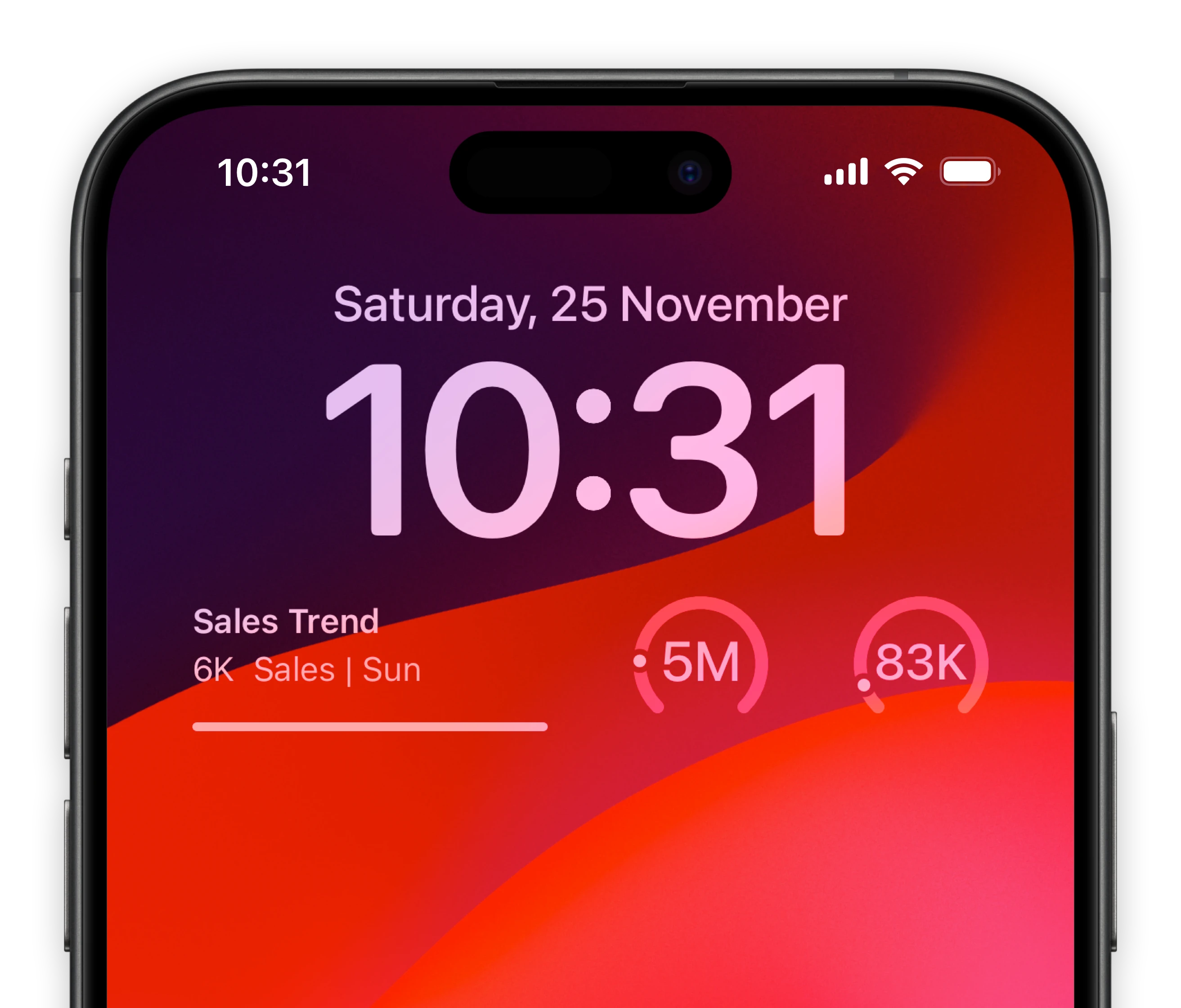
Lock-screen widgets on your iPhone.

Keep track of your most important infrastructure metrics of Pingdom right from your iPhone lock screen.

Micro Pingdom dashboards for your iOS Lock-screens
A mini Pingdom dashboard for your MacOS Notification Center

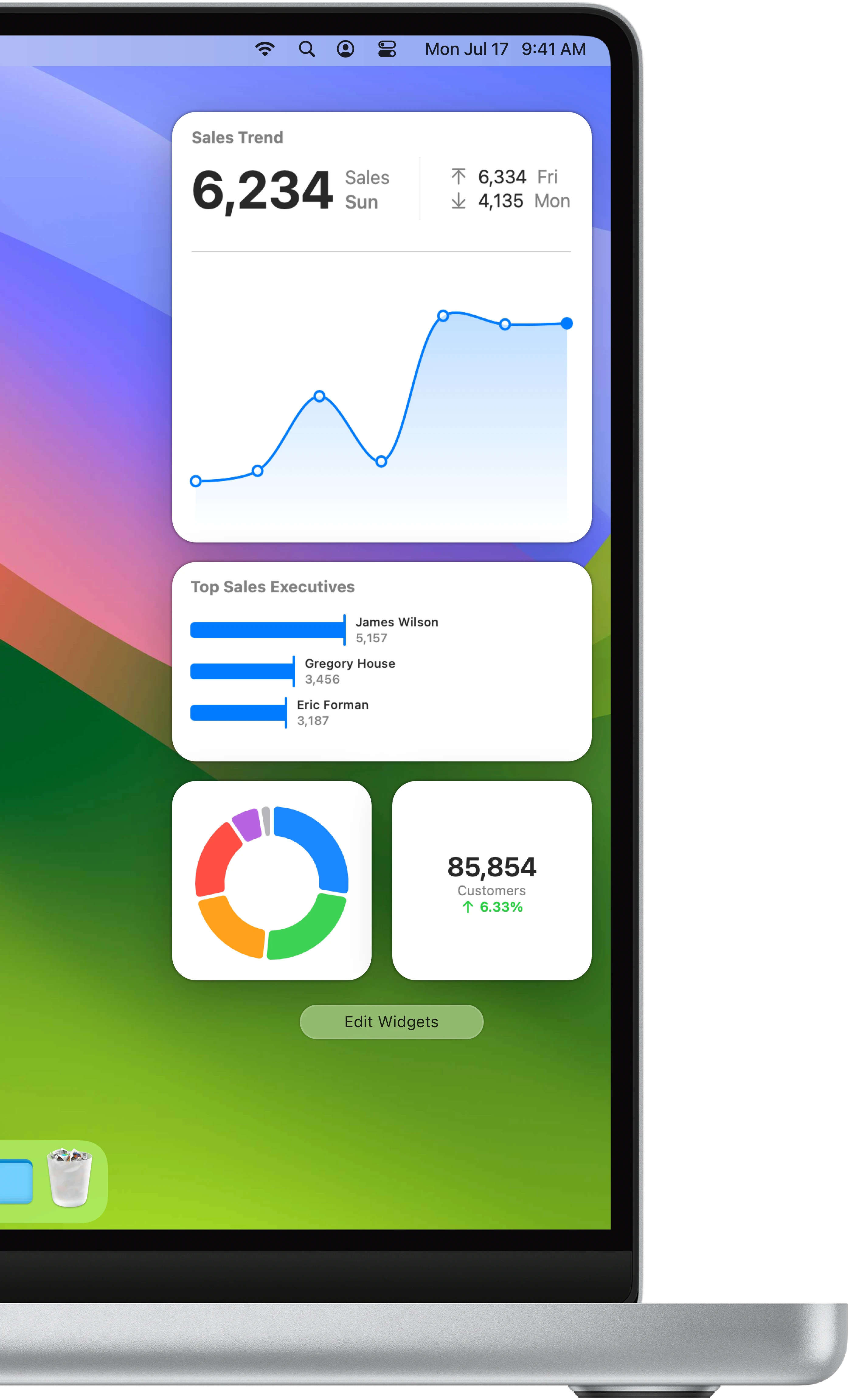
Notification center widgets for your Mac.

Connect your Pingdom metrics to your MacOS sidebar.

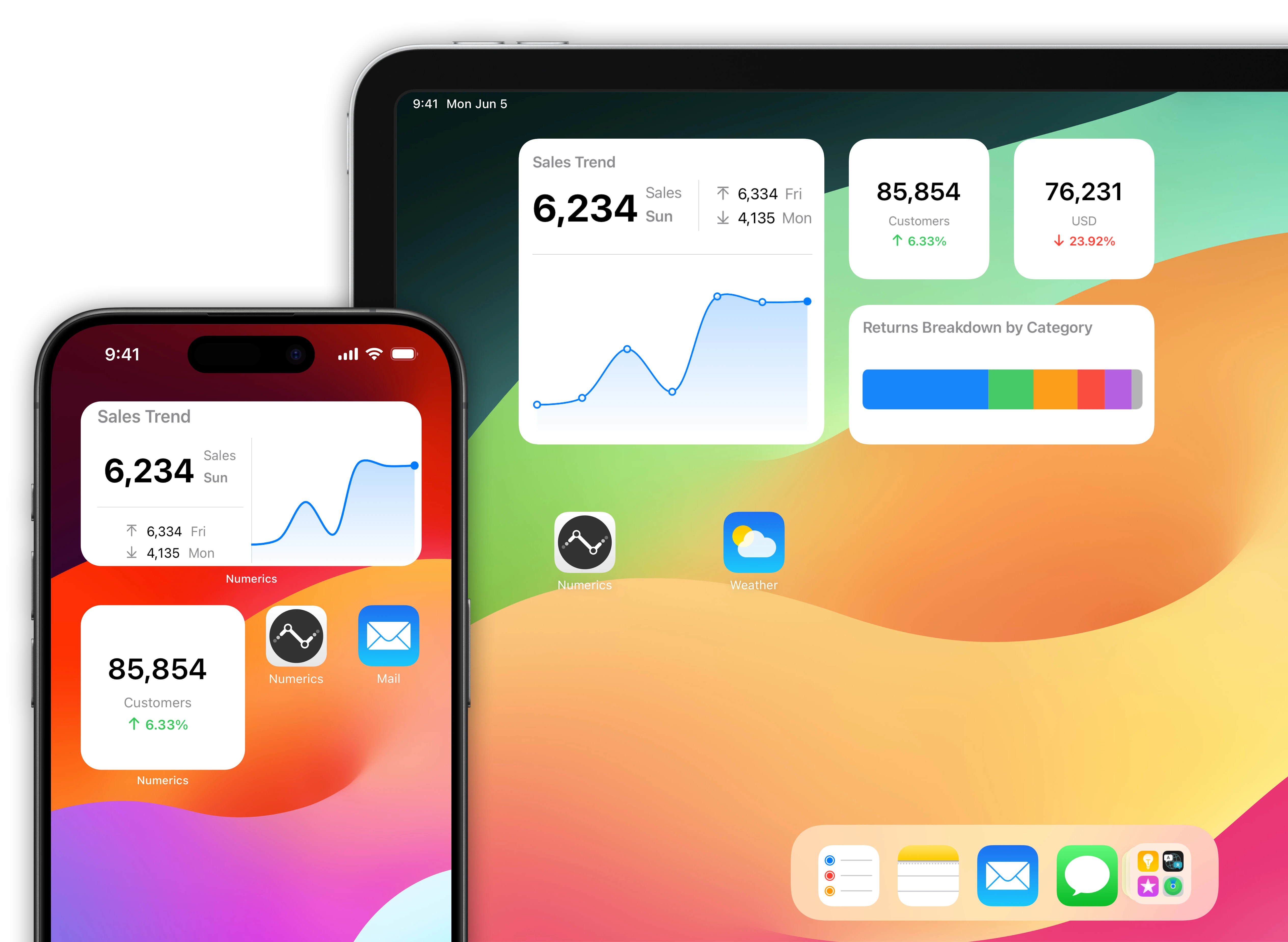
Pingdom data driven home screens for your iOS Devices.

Native home screen widgets for your iPad & iPhone powered by data from your Pingdom account.

A mini Pingdom dashboard for your iOS home screen

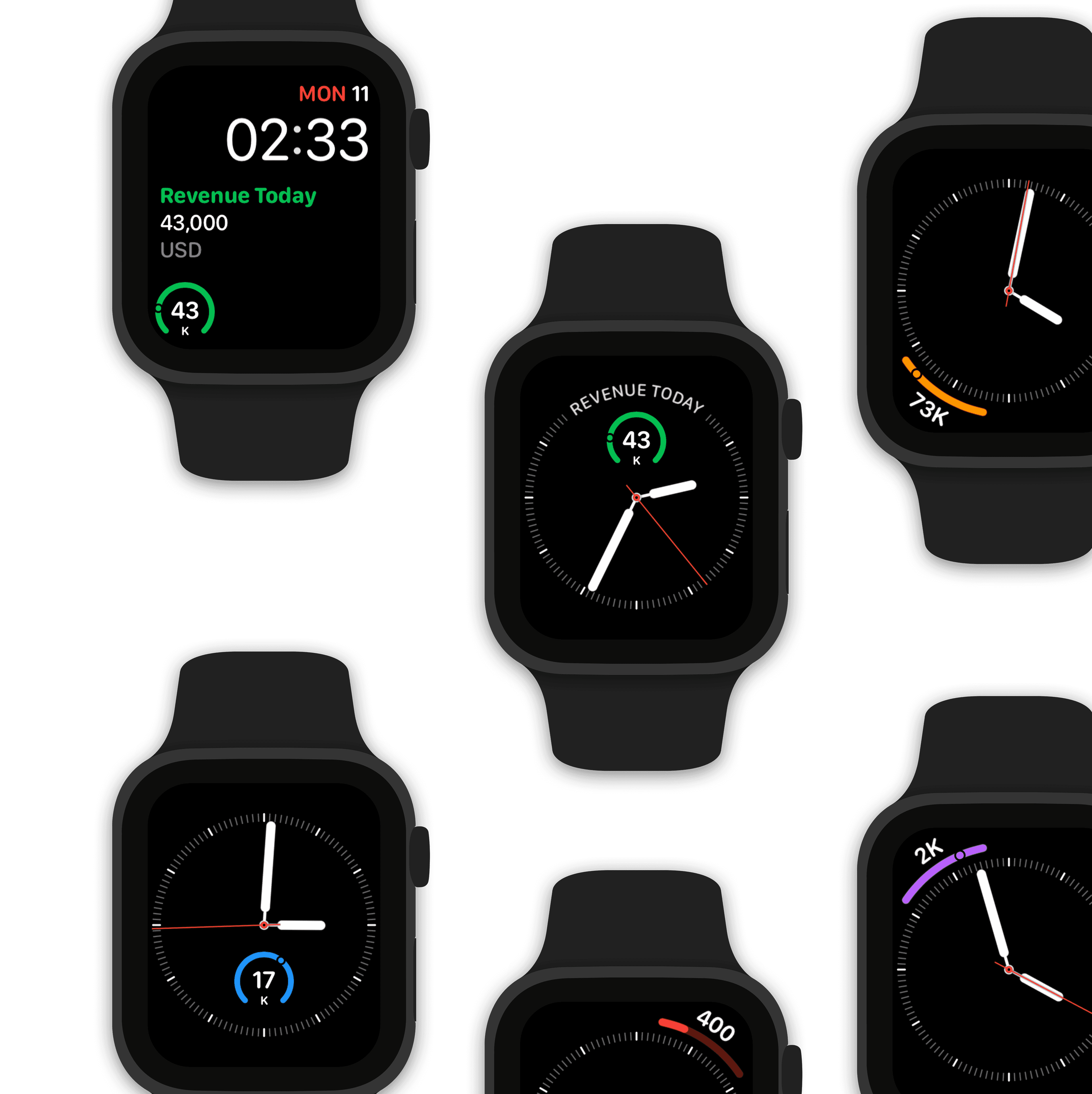
Watch complications for your Apple Watch faces.

Design a custom Dev Ops watch face using Pingdom data.

Make Siri Pingdom data aware!

“Hey Siri, what’s the uptime status of my website?"

“The uptime status of your webite is up since 336 days

Collaboratively build dashboards with teams in real-time

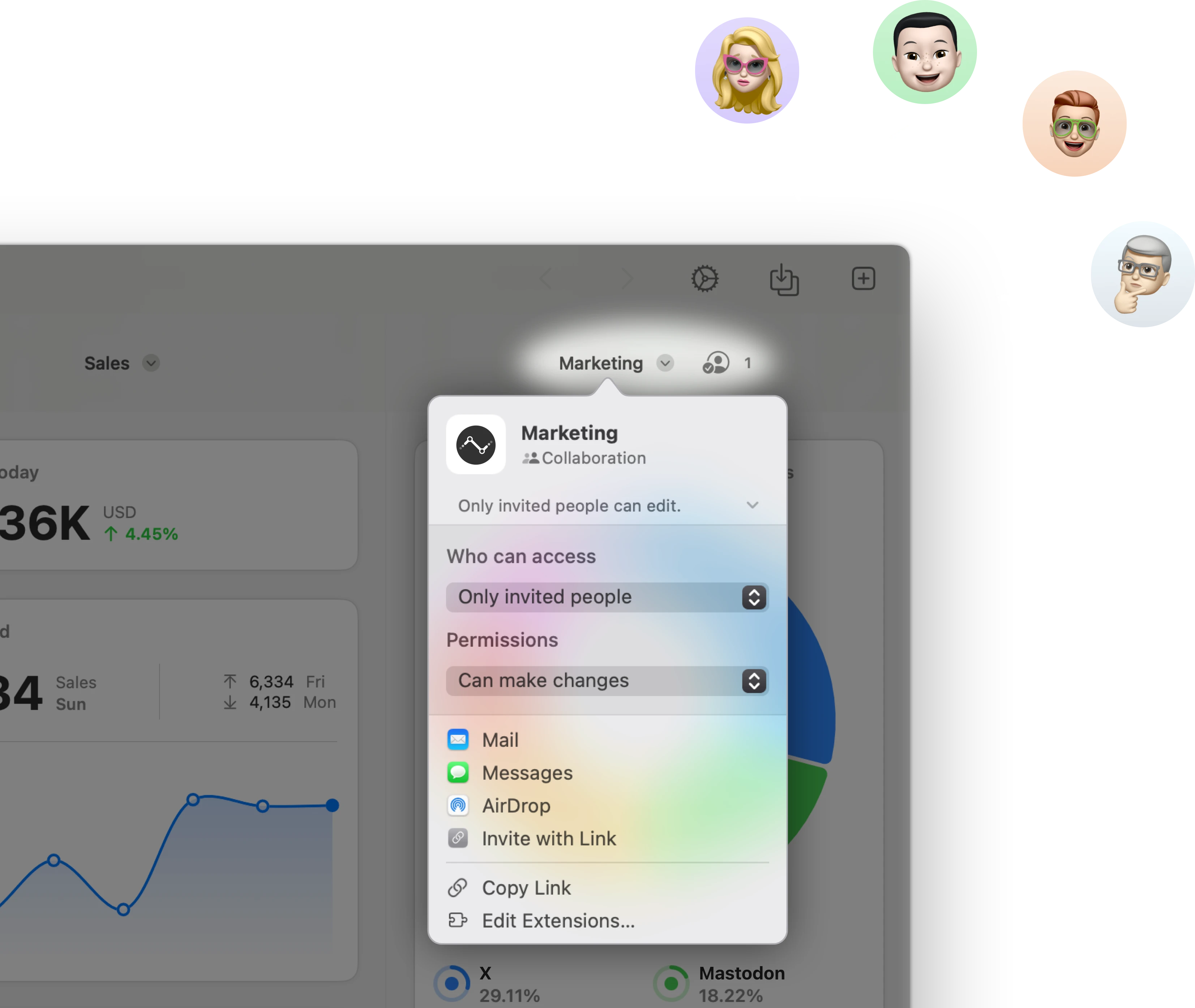
Stream & share Pingdom KPIs with other users.

Stream a Dev Ops dashboard to other Numerics users & co-create dashboards with your team in real-time via secure iCloud sharing & collaboration with Messages.

Related Documents:

Related Blog Posts:

Pingdom Integration Specifications:

SolarWinds Corporation Support:

Related Integrations

Delighted Dashboards

Delighted

Keep track of arguably the most important metric of business - your company’s Net Promoter Score (NPS).

Help Scout Dashboards

Help Scout

Track support staff performance & drive customer success.

Salesforce Dashboards

Salesforce

Monitor sales pipelines, CRM & campaign performance, or build a dashboard with metrics from Salesforce custom data objects using SOQL queries.

Get Numerics

The KPI dashboard app

Numerics icon-ws
Numerics icon-ws