Track app usage distribution and performance across versions with real-time updates. Stay ahead of the curve with Flurry's Distribution of Active Devices widget.
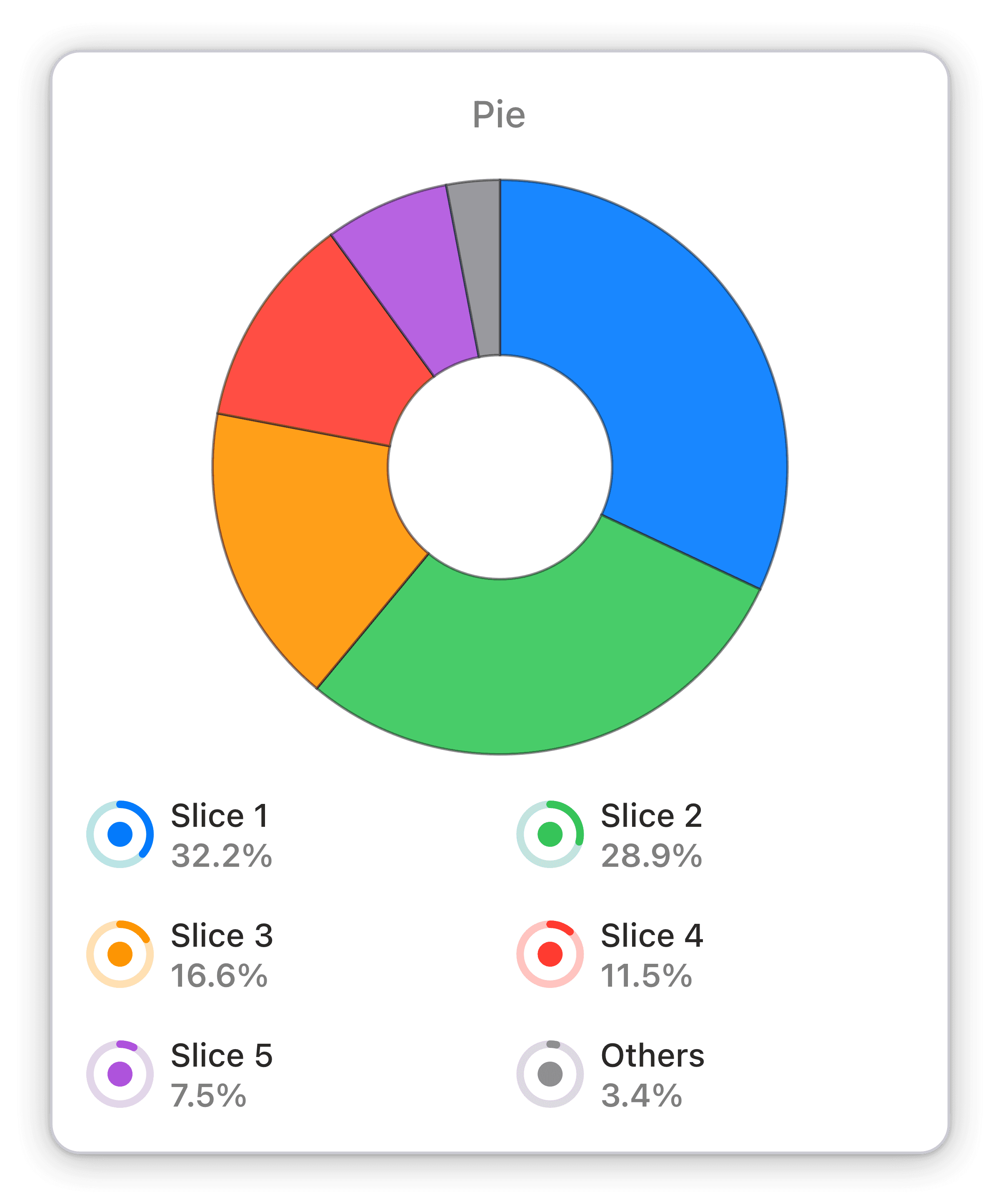
The Pie Chart widget in Numerics allows you to track the percentage distribution of a specific KPI across different categories. With a simple and intuitive visual display, you can quickly see how the values compare to each other and identify any trends or anomalies. Whether you're monitoring sales by region or tracking website traffic by source, the Pie Chart widget provides a clear and concise way to visualize your data and make informed decisions.
Benefits of Tracking Distribution of active devices across all versions of app in Flurry mobile Analytics dashboards
The Distribution of Active Devices widget offers a quick and easy way to track the number of unique devices accessing your app across different versions. Using this widget, you can easily visualize the distribution of your app usage and understand how different versions are performing. With real-time updates, you can keep a close eye on your KPIs and ensure that you are on track to meet your goals. Being aware of your app's performance at all times is crucial for staying ahead of the curve and making informed decisions.
Full Integration Details:
Part of the flurry
App Usage Widget Pack
Identify trends and track KPIs relating to user behavior within your mobile app.
Flurry Integration Specifications:
Widget Templates:
119
Authentication Type:
Token based auth
Supported plans:
All


