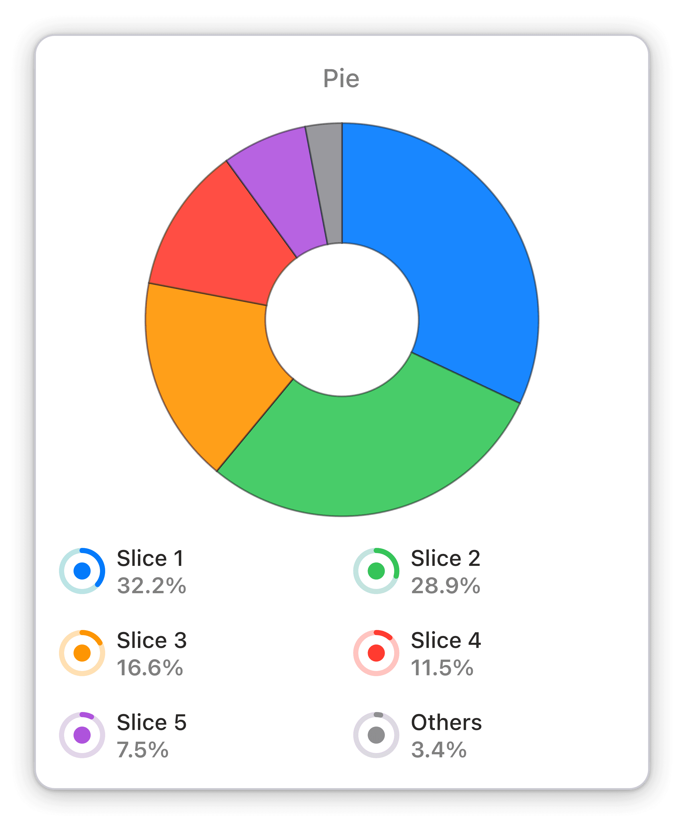
Device categories by average session duration
Average session duration broken down by devices: mobile, desktop or tablet used to access your web property within your chosen time span.
Track web property engagement on mobile, desktop, and tablet with Numerics' Google Universal Analytics Device Categories by Average Session Duration widget.
The Pie Chart widget in Numerics is the perfect tool for tracking changes in market share, audience demographics, or any other data that can be represented as a percentage. With an interactive interface and intuitive design, this widget makes it easy to visualize and understand even complex data sets. Whether you're tracking your company's performance or keeping an eye on industry trends, the Pie Chart widget in Numerics is an essential tool for any data-driven business.
The Device Categories by Average Session Duration widget provides a real-time overview of how your web property is being accessed, whether on mobile, desktop or tablet. This widget helps you identify which device category is most popular among your users and how long they are spending on your web property. With this information, you can make data-driven decisions to optimize your website for the device category with the highest engagement and improve user experience.
Part of the google universal analytics


