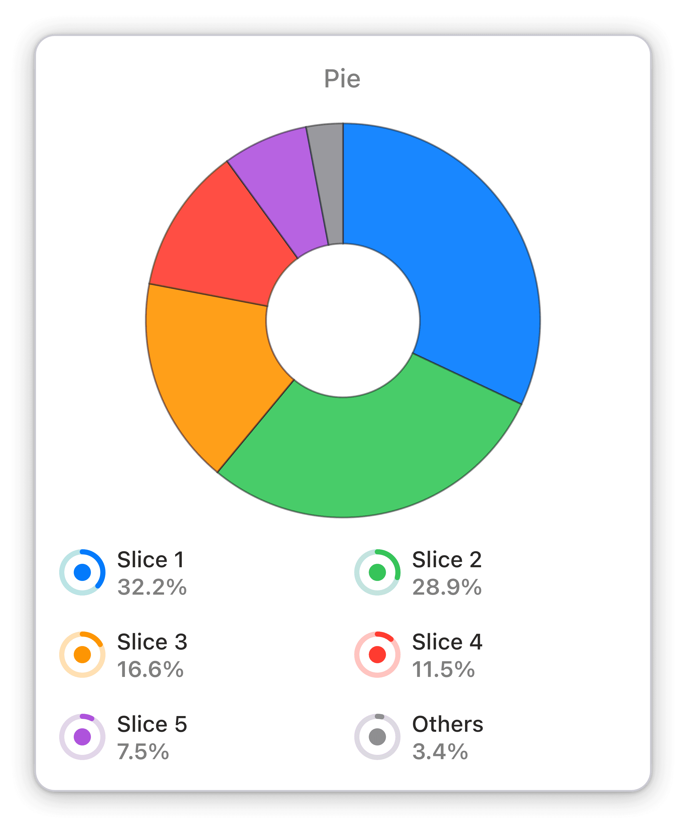
Device categories by percentage new sessions
Percentage of new sessions broken down by devices: mobile, desktop or tablet used to access your web property within your chosen time span.
Optimize your business's performance with Numerics' Google Universal Analytics widget, breaking down new sessions by device category.
The Device Categories by Percentage New Sessions pie chart widget is a powerful tool for business owners and analysts alike. With its simple yet effective visualization, this widget breaks down new sessions by device category, providing a clear and concise picture of user behavior on your web property. Analyze trends and optimize performance with ease using this intuitive and customizable visualization, available exclusively on Numerics.
As a business owner or analyst, keeping track of new sessions by device is crucial for making informed decisions. Numerics' Google Universal Analytics pie chart widget breaks down these sessions by device category, giving you a clear picture of how your web property is being accessed. With this widget, you can easily identify trends and optimize your performance to drive your business forward. And with Numerics' live dashboards, you can access this information in real-time and make quick, data-driven decisions with confidence.
Part of the google universal analytics


