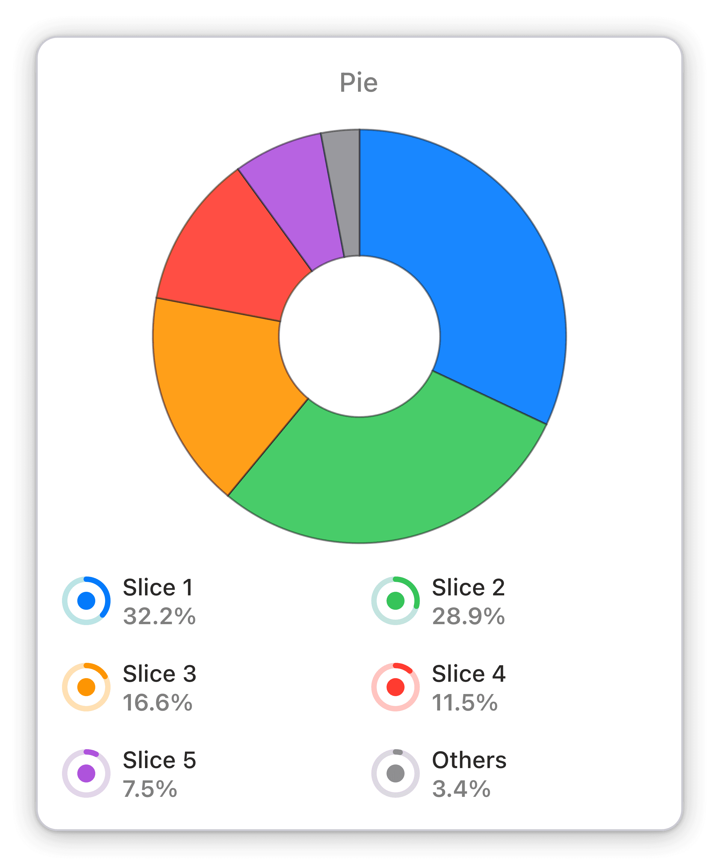
Distribution of time per sessions by UTM types
The time per sessions broken down by UTM types for your chosen analytics view within your chosen time span.
Optimize your marketing campaigns with Numerics' Hubspot Marketing Hub widget: Distribution of time per sessions by UTM types.
The Distribution of time per sessions by UTM types pie chart widget from Numerics is an essential tool for tracking marketing performance trends. The widget provides a clear visualization of the time spent per session for each UTM type, enabling you to identify areas for improvement and optimize your marketing campaigns accordingly. With its real-time data display, the widget empowers you to stay on top of your marketing KPIs and make informed decisions based on the insights gained.
Benefits of Tracking Distribution of time per sessions by UTM types in HubSpot Marketing Hub marketing dashboards
The Distribution of time per sessions by UTM types pie chart widget from Numerics is an essential tool for tracking your marketing performance trends. With the ability to display data in real-time, it allows you to stay on top of your KPIs and make informed decisions based on the insights gained. By analyzing the time spent per session for each UTM type, you can identify areas for improvement and optimize your marketing campaigns accordingly. With Numerics, you can be confident that you are always aware of your marketing performance and can take action to improve it as needed.
Full Integration Details:
Part of the hubspot marketing hub
Sessions Widget Pack
HubSpot Marketing Hub Integration Specifications:
Widget Templates:
262
Authentication Type:
OAuth 2.0
Supported plans:
Professional, Enterprise


