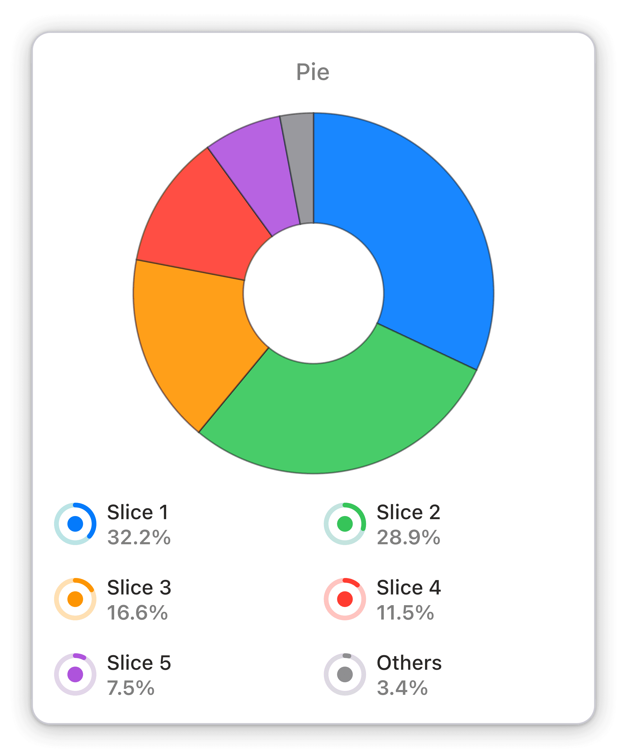
Distribution of time spent by countries
The time spent broken down by countries for your chosen analytics view within your chosen time span.
Visualize time spent by country on your HubSpot Marketing Hub with real-time data in an interactive pie chart. Optimize marketing strategies.
The Distribution of Time Spent by Countries widget is an interactive pie chart that visualizes the time spent on your HubSpot Marketing Hub by country, all in real-time. With this widget, you can easily see how your marketing efforts are performing in different countries, identify trends, and optimize your strategies accordingly. It's the perfect tool for businesses looking to stay on top of their game and make data-driven decisions quickly and effectively.
Benefits of Tracking Distribution of time spent by countries in HubSpot Marketing Hub marketing dashboards
With the Distribution of time spent by countries widget on your Numerics dashboard, you can keep track of the time spent on your HubSpot Marketing Hub by country, all in real-time. This means you don't have to rely on outdated reports or manually comb through data to get a clear picture of your marketing efforts. By giving you an interactive pie chart that breaks down your time spent by country, you can easily identify trends, optimize your marketing strategies, and stay on top of your game.
Full Integration Details:
Part of the hubspot marketing hub
Sessions Widget Pack
HubSpot Marketing Hub Integration Specifications:
Widget Templates:
262
Authentication Type:
OAuth 2.0
Supported plans:
Professional, Enterprise


