

Distribution of time spent by UTM types
The time spent broken down by UTM types for your chosen analytics view within your chosen time span.
Power up your HubSpot marketing with real-time tracking of time spent by UTM types in Numerics' Pie Chart widget.
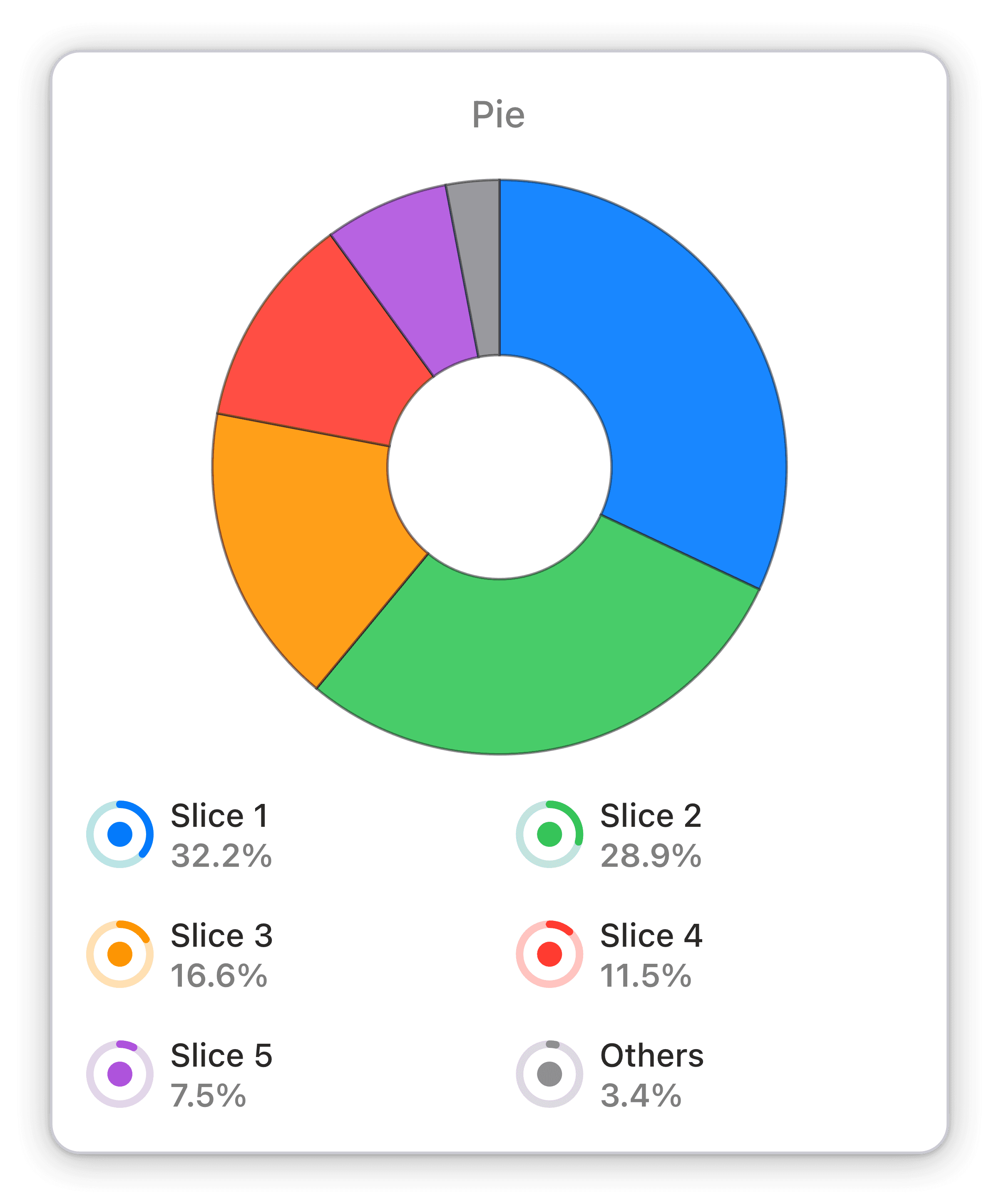
The Distribution of Time Spent by UTM Types widget in Numerics presents a clear visual breakdown of how your customers are spending their time on your website. With a detailed pie chart, this widget makes it easy to understand the percentage of time spent on each UTM type. Marketers can use this widget to optimize their campaigns and ensure that their marketing efforts are aligned with their business goals.
Benefits of Tracking Distribution of time spent by UTM types in HubSpot Marketing Hub marketing dashboards
The Distribution of Time Spent by UTM Types widget in Numerics is an essential tool for marketers looking to make data-driven decisions. With real-time tracking, you can easily see how your customers are spending their time on your website and ensure that your marketing efforts are aligned with your business goals. By measuring KPIs with this widget, you ensure that your marketing strategy is always on track, making it easier to optimize campaigns and increase ROI.
Full Integration Details:
Part of the hubspot marketing hub
Sessions Widget Pack


HubSpot Marketing Hub Integration Specifications:
Widget Templates:
262
Authentication Type:
OAuth 2.0
Supported plans:
Professional, Enterprise

