
Pie chart from spreadsheet macro
A pie chart from a macro enabled Excel Online Spreadsheet.
Visualize macro-enabled Excel data in real-time with Numerics' customizable pie chart widget for Microsoft Office 365.
Visualize your macro-enabled Excel Online Spreadsheet data in real-time with Numerics' customizable pie chart widget. Keep a constant eye on your business's key metrics with ease and make informed decisions effortlessly.
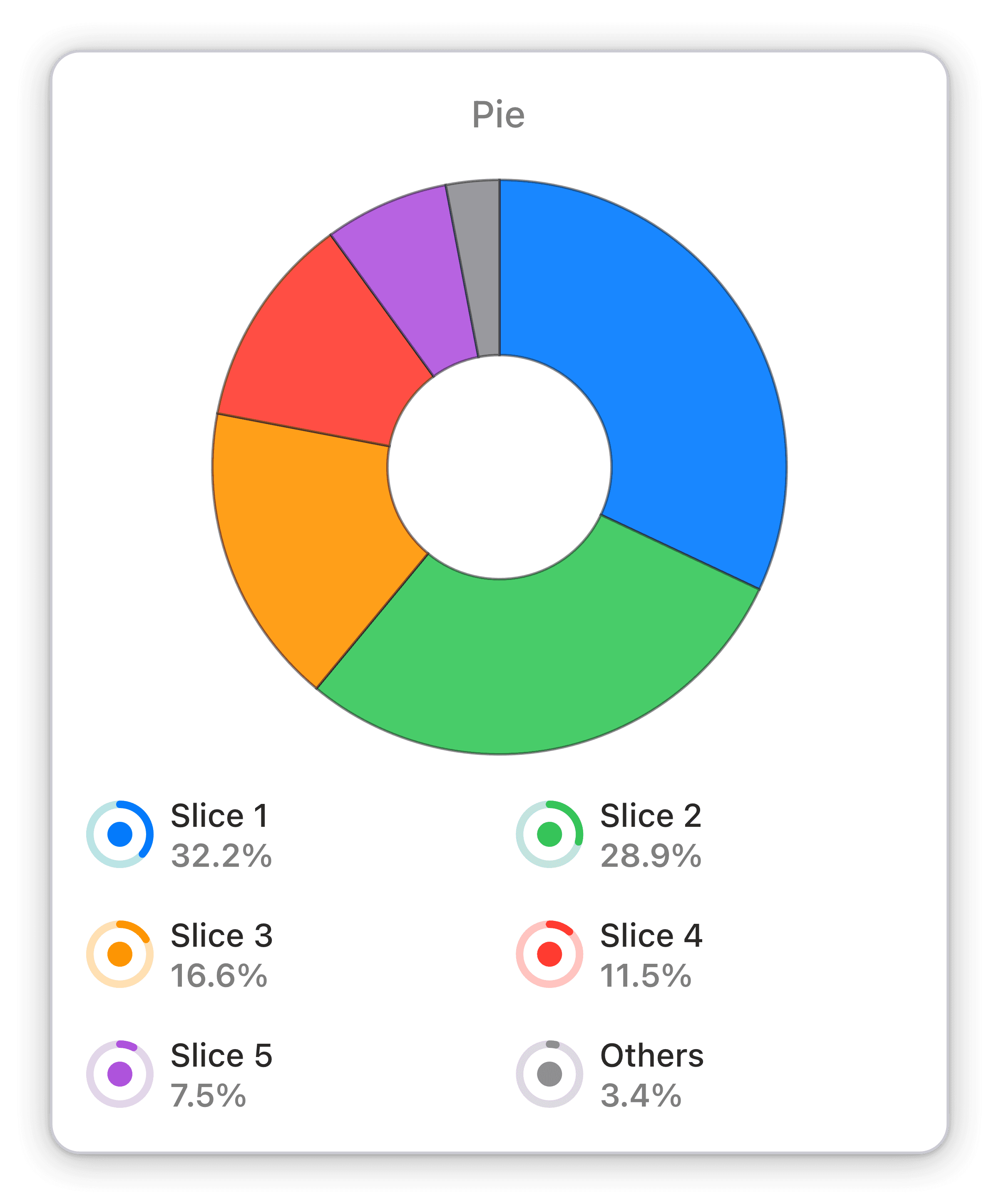
Pie charts are a simple yet effective way to track KPIs in real-time. With Numerics' pie chart widget, you can easily visualize data from your macro-enabled Excel Online Spreadsheet, and keep a constant eye on your business's key metrics. This widget is customizable, giving you the flexibility to display the data that matters most to your business. Stay on top of your KPIs and make informed decisions with Numerics' pie chart widget.
Part of the Microsoft Excel
Widgets From Sharepoint Macros Widget Pack
Get more insights into your business with custom line graphs, pie charts, density charts and more from Sharepoint data.

